Using the wrong image size is one of the most common reasons websites load slowly — and slow websites lose visitors, rank lower on Google, and convert fewer customers. A single oversized hero image can add 3 to 5 seconds to your page loading time. Get the dimensions and file sizes right and your website loads fast, looks sharp, and scores well on Google Core Web Vitals.
This guide covers the correct image dimensions and file sizes for every part of your website — hero images, blog posts, product pages, thumbnails, open graph images, and more. We also cover social media image sizes, how to resize and compress correctly, and exactly how image size connects to your SEO performance in 2026.
Why Image Size Affects Everything on Your Website
Image size affects three things that matter enormously for any website — loading speed, visual quality, and SEO rankings. Get all three right and your website performs well across the board. Get any one of them wrong and the problems compound quickly.
When you upload an image that’s too large in pixel dimensions, the browser downloads the full oversized image and then shrinks it to fit the display area. All that extra data gets downloaded and thrown away. Your visitor’s browser did unnecessary work, used unnecessary bandwidth, and waited longer — for no visible benefit at all.
When you upload an image that’s too small for its display area, the browser has to stretch it to fill the space. Stretching a small image makes it blurry and pixelated. This looks unprofessional and tells visitors the website is low quality.
Getting both right — large enough to look sharp, small enough to load fast — is what image size optimisation is all about. According to Google’s PageSpeed documentation, properly sizing images is one of the highest-impact optimisations for web page performance.
Understanding Image Dimensions vs File Size
What Are Image Dimensions?
Image dimensions are the pixel width and height of an image — written as width × height. A 1200 × 628 image is 1200 pixels wide and 628 pixels tall. Dimensions determine how large the image appears on screen and how much pixel data needs to be stored in the file.
Dimensions are the first thing to get right. Before thinking about compression or format, make sure the pixel dimensions match the actual display size on your website. An image displayed at 800px wide should be 800px wide in the file — not 4000px wide that gets scaled down by the browser.
What Is File Size?
File size is how many bytes the image takes up on disk and in the browser’s download. File size is determined by the combination of pixel dimensions, image format, and compression level. Two images with identical pixel dimensions can have very different file sizes depending on format and compression.
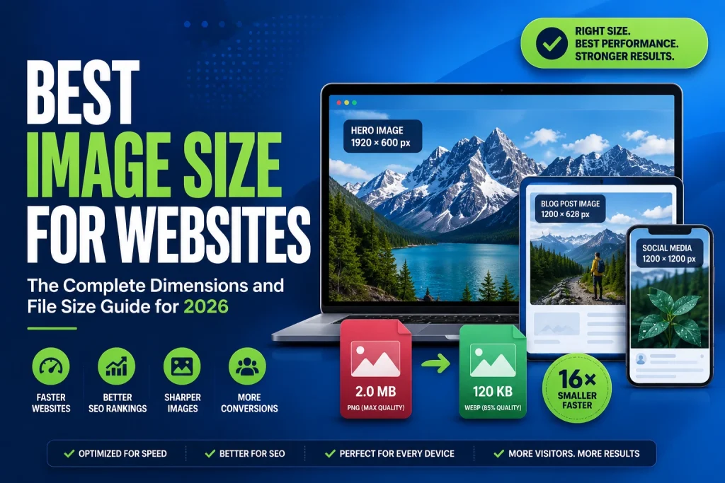
A 1200 × 628 image saved as PNG at maximum quality might be 2MB. The same image saved as WebP at 85 percent quality might be 120KB. Both display at exactly the same size — but one takes 16 times longer to download. File size is what directly affects loading speed.
The Right Order of Operations
Always fix dimensions first, then fix file size. Resize to the correct pixel dimensions. Then convert to the right format. Then compress to the target file size. Doing these in this order gives you the smallest possible final file at the best possible quality. Our guide on how to reduce image file size covers the compression step in full detail with realistic before and after numbers.
The Golden Rules of Website Image Sizing
Before getting into specific dimensions, these four rules apply to every image on every website. Follow them consistently and your image sizing will be right every time.
Rule 1 — Never upload larger than the display size. If an image displays at 800px wide on your website, upload it at 800px wide. Not 2000px, not 4000px. Exactly 800px. The browser can’t display more pixels than the screen space allows — extra pixels are just wasted download time.
Rule 2 — Always maintain the aspect ratio. The aspect ratio is the relationship between width and height. Changing one dimension without proportionally changing the other stretches or squashes the image and makes everything in it look distorted. Always resize with the aspect ratio locked.
Rule 3 — Use WebP format for all web images. WebP is 25 to 35 percent smaller than PNG and JPG at the same visual quality. Switching to WebP reduces file sizes across your whole website without any visible quality change. Our article on what is WebP format explains why WebP is the best choice for web images in 2026.
Rule 4 — Target under 150KB per image for most web use. This is the practical target for most website images. Under 150KB per image, pages load fast on mobile connections. Above 200KB, images start contributing meaningfully to slow loading. Above 500KB, images are almost certainly over-sized and over-weight for web use.
Best Image Sizes for Every Part of Your Website
Hero Images and Banner Images
Hero images sit at the top of the page and are usually the first thing a visitor sees. They’re also typically the largest image on any page — which makes them the most important to get right for loading speed and Core Web Vitals.
The hero image is almost always the Largest Contentful Paint element on a page. LCP measures how long it takes for the largest visible content element to load — and Google uses LCP as a Core Web Vitals ranking factor. A large, poorly optimised hero image directly hurts your LCP score and your search rankings.
Recommended dimensions: 1920 × 1080px for full-width hero images. This covers most desktop screen widths while keeping dimensions manageable.
For retina screens: Upload at 2560 × 1440px if you want pixel-perfect sharpness on retina displays. Combine with strong WebP compression to keep file size reasonable.
Target file size: Under 200KB as WebP. Under 300KB is acceptable for retina-resolution hero images.
Tips:
- Never upload a raw camera photo as a hero image — they’re typically 3 to 8MB and several thousand pixels wide in all directions
- Use WebP format — a 1920 × 1080px hero image as WebP at 85 percent quality typically sits between 100 and 200KB
- Don’t add lazy loading to hero images — they need to load immediately for a good LCP score
- Keep the focal point of the image centred — hero images often get cropped differently on mobile vs desktop
Blog Featured Images
Blog featured images appear at the top of blog posts and in blog listing pages. They also serve as Open Graph images when posts are shared on social media — so they need to look good both on your website and when shared on Facebook, Twitter, LinkedIn, and messaging apps.
Recommended dimensions: 1200 × 628px. This is the ideal size for two reasons — it’s large enough to look sharp as a blog header, and it matches the Open Graph image dimensions that social platforms use when displaying shared links.
Target file size: Under 150KB as WebP. Most blog featured images can comfortably sit between 60 and 120KB at this dimension with good WebP compression.
Tips:
- Use the same image for both your featured image and your Open Graph meta tag — 1200 × 628 works for both
- Make sure important content like text or faces are in the centre — social platforms sometimes crop these images differently
- Add descriptive alt text that describes the image and includes your target keyword naturally
Blog Inline Images
Inline images appear within blog post content — screenshots, diagrams, comparison images, and illustrative photographs. These don’t need to be as wide as featured images because they sit within a content column, not full-width.
Recommended dimensions: 800px to 1200px wide depending on your content column width. Check your theme’s content column width and use that as your maximum width.
Target file size: Under 100KB as WebP for most inline images. Simple diagrams and screenshots can often be under 50KB.
Tips:
- Screenshots with text should use WebP lossless or PNG — lossy compression creates visible blurring around text characters
- For comparison images side by side, make sure the combined width fits within the content column without horizontal scrolling on mobile
- Add lazy loading to all inline images — they’re below the fold and don’t need to load immediately
Product Images for eCommerce
Product images are critical for eCommerce websites. They need to be large enough to show product details clearly — which matters for purchasing decisions — but small enough to load fast. Slow product pages directly reduce conversion rates.
Recommended dimensions: 800 × 800px to 1200 × 1200px depending on whether your product pages support zoom. Square aspect ratio (1:1) works best for most product display layouts.
For zoom functionality: Upload at 2000 × 2000px to provide enough resolution for close-up zoom views. Use strong WebP compression to keep file sizes manageable at this larger dimension.
Target file size: Under 150KB per product image as WebP. For zoom-enabled product images, under 400KB is acceptable given the larger dimensions needed.
Tips:
- Use consistent dimensions across all product images — mixing portrait, landscape, and square images in a product grid looks messy
- For products with multiple colour variants, maintain the same dimensions and composition for all variant images
- Product images on white or transparent backgrounds should use WebP with transparency support — it’s cleaner than using PNG
- Include the product name and colour in the alt text — this helps product images rank in Google Image Search and Google Shopping
Thumbnail Images
Thumbnails appear in blog listing pages, product category grids, related post sections, and search results within your website. They need to be small, fast, and recognisable at a small size.
Recommended dimensions: 400 × 300px for landscape thumbnails. 400 × 400px for square thumbnails. 300 × 400px for portrait thumbnails.
Target file size: Under 30KB as WebP. Thumbnails are small images — there’s no reason for them to be larger than 30KB.
Tips:
- Make sure your thumbnail images are visually clear at small sizes — detailed images with lots of fine texture look muddy as thumbnails
- Use lazy loading for all thumbnail grids — category pages with 24 or 48 products should not load all images simultaneously
- Crop thumbnails to a consistent aspect ratio before uploading — mixed aspect ratios in a grid look unprofessional
Logo Images
Your website logo appears on every page — in the header, footer, and sometimes in multiple locations throughout the site. Logo loading time is multiplied across every page view on your website, so keeping logo files small is important.
Recommended format: SVG is the ideal format for logos — it scales perfectly to any size, looks sharp on all screen resolutions including retina, and the file size for a simple logo SVG is typically under 10KB.
If SVG is not available: Use WebP or PNG. For web display, keep the logo file under 20KB. Upload at 2x the display size for retina sharpness — so if your logo displays at 200px wide, upload at 400px wide.
Tips:
- Never use JPG for logos — JPG compression creates visible artefacts around the sharp edges of logo elements
- If you only have a raster logo (JPG or PNG), our article on how to convert JPG to SVG explains the conversion process and what results to expect
- Logos with transparent backgrounds should be WebP or PNG — never JPG
Open Graph Images
Open Graph images are what appear when someone shares your webpage on social media — Facebook, Twitter, LinkedIn, WhatsApp, and messaging apps all pull the Open Graph image to display as a preview. These images directly affect click-through rates on shared links.
Recommended dimensions: 1200 × 630px. This is the standard Open Graph image size that works well across all major social platforms.
Target file size: Under 150KB. Social platforms cache and re-display these images, so they don’t need to be served lightning fast from your server — but keeping them under 150KB is good practice.
Tips:
- Set your Open Graph image in WordPress using an SEO plugin like Yoast or Rank Math
- Use your blog featured image as your Open Graph image — at 1200 × 628px, it’s close enough to the 1200 × 630px Open Graph standard to work well
- Include your website name or logo in the Open Graph image — it reinforces brand recognition when the image appears on social media
Background Images
Background images appear behind other content — in section backgrounds, full-page backgrounds, and hero section backgrounds where text overlays the image. They cover large screen areas which means they need careful handling to stay fast.
Recommended dimensions: 1920 × 1080px for full-width section backgrounds. For backgrounds that only appear in narrower sections, use the width of that section as your maximum.
Target file size: Under 300KB as WebP. Background images are often very large on screen which makes WebP compression especially important.
Tips:
- Background images with text overlaid on them don’t need to be as sharp as standalone images — viewers focus on the text, not the image detail — so you can apply stronger compression without visible issues
- Consider using CSS gradients instead of image backgrounds wherever possible — CSS loads instantly and has zero file size impact
- Add a solid colour fallback in CSS for the background area — this displays immediately while the background image loads, preventing a jarring flash of white
Favicon
The favicon is the tiny icon that appears in browser tabs, bookmarks, and mobile home screens. It needs to be pixel-perfect at very small sizes.
Recommended dimensions:
- 16 × 16px — standard browser tab favicon
- 32 × 32px — higher resolution browser tab
- 180 × 180px — Apple touch icon for iOS home screen
- 192 × 192px — Android home screen icon
Recommended format: ICO for the standard favicon file, PNG for the larger touch icons.
Tips:
- Keep favicons visually simple — complex logos become unrecognisable at 16 × 16px
- Use your logo mark rather than your full logo wordmark — initials or a symbol work much better than text at favicon sizes
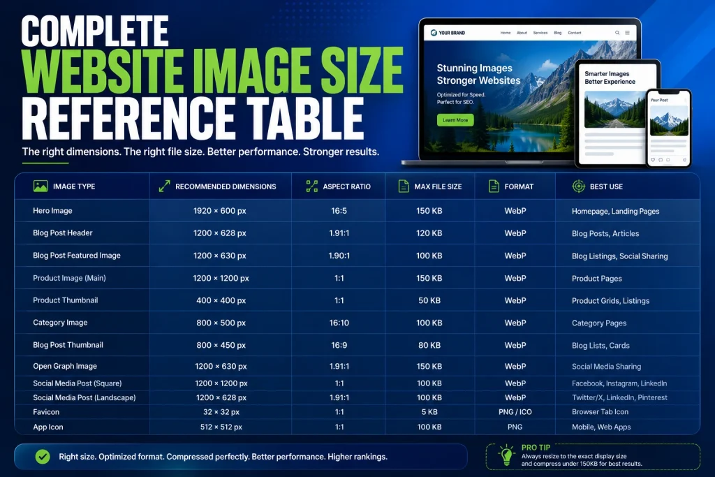
Complete Website Image Size Reference Table
| Image Type | Dimensions | Target File Size | Best Format |
|---|---|---|---|
| Hero / Full-width banner | 1920 × 1080px | Under 200KB | WebP |
| Hero (retina) | 2560 × 1440px | Under 350KB | WebP |
| Blog featured image | 1200 × 628px | Under 150KB | WebP |
| Blog inline image | 800 – 1200px wide | Under 100KB | WebP |
| Product image | 800 × 800px | Under 150KB | WebP |
| Product image (with zoom) | 2000 × 2000px | Under 400KB | WebP |
| Thumbnail | 400 × 300px | Under 30KB | WebP |
| Logo | Flexible | Under 20KB | SVG or WebP |
| Open Graph image | 1200 × 630px | Under 150KB | WebP |
| Background image | 1920 × 1080px | Under 300KB | WebP |
| Favicon | 32 × 32px | Under 5KB | ICO or PNG |
| Apple touch icon | 180 × 180px | Under 20KB | PNG |
How to Resize Images to the Correct Dimensions
Using Our Free Online Resizer
The fastest way to resize any image to the correct dimensions is using a free online tool. No software, no account, works on any device.
- Go to our free Image Resizer
- Upload your image
- Enter your target width and height in pixels
- Make sure the aspect ratio lock is enabled
- Click Resize
- Download the correctly sized image
You can upload multiple images at once and resize them all to the same dimensions in one go. This is especially useful when preparing a batch of product images or blog images that all need identical dimensions.
Resizing on Mac Using Preview
- Open the image in Preview
- Go to Tools > Adjust Size
- Make sure the chain link between width and height is locked
- Enter your target width in pixels — height adjusts automatically
- Click OK and save
Resizing on Windows Using Paint
- Open the image in Paint
- Click Resize in the toolbar
- Select Pixels
- Enter your target width — check Maintain aspect ratio
- Click OK and save
For more detail on resizing methods across all devices and platforms, our article on how to resize an image covers everything including batch resizing on Mac and the correct dimensions for social media platforms.
How to Check Your Current Image Sizes
Checking on Your Website
To check what dimensions an image actually displays at on your website, right-click any image and select Inspect Element. The browser developer tools will show you two sets of dimensions — the intrinsic size (the actual pixel dimensions of the file) and the rendered size (the size it displays at on screen).
If the intrinsic size is significantly larger than the rendered size — for example, 3000px wide intrinsic but 900px wide rendered — the image is oversized and needs to be resized down to match the rendered size.
Using Google PageSpeed Insights
Go to Google PageSpeed Insights and enter your website URL. Run a test and look for the “Properly size images” recommendation. If this appears, PageSpeed will list the specific images that are oversized and tell you exactly how much data could be saved by resizing them correctly.
Fix each image it flags, re-upload, and run the test again to confirm the recommendation disappears. Each fixed image improves your PageSpeed score and reduces your total page weight.
Using Browser Developer Tools
In Chrome, press F12 to open Developer Tools. Go to the Network tab and filter by Img to see all image requests for the current page. This shows you the file size of every image loaded on the page — so you can identify which images are the largest contributors to total page weight and prioritise those for optimisation.
Image Size and Core Web Vitals — The Direct Connection
Largest Contentful Paint (LCP)
LCP measures how quickly the largest visible content element loads. On most websites, that element is an image. Google wants LCP under 2.5 seconds. Oversized, heavy images are the most common reason websites fail this target.
Reducing your hero image from 3MB to 180KB can cut your LCP by 2 to 3 seconds on a typical mobile connection. That single change can take a failing LCP score and push it into the Good range. According to Google’s LCP documentation, optimising the LCP image is the single highest-impact change for most websites.
Cumulative Layout Shift (CLS)
CLS measures how much the page jumps around while loading. Images without defined width and height attributes cause layout shifts — when the image loads, it pushes all the content below it downward. Always define width and height on your image tags to prevent this.
html
<img src="hero-image.webp" alt="Description" width="1920" height="1080">Also add height: auto in your CSS so the image scales responsively while maintaining the correct aspect ratio for layout calculations.
Interaction to Next Paint (INP)
INP replaced First Input Delay as a Core Web Vitals metric in March 2024. While INP is primarily about JavaScript responsiveness, heavy pages loaded with oversized images can indirectly affect INP by consuming browser resources during loading. Keeping total image weight low contributes to a more responsive page overall.
Image Size for Mobile — Why It Needs Special Attention
Most Website Traffic Is Mobile
In 2026, mobile devices account for more than 60 percent of global web traffic. Google uses mobile-first indexing — it crawls and ranks your website based on its mobile version. This means your image optimisation needs to be correct for mobile screens first, not desktop screens.
Mobile screens are smaller than desktop screens, which means the correct display dimensions for mobile are smaller. A full-width image on mobile might display at 390px wide on an iPhone — but if you’re serving a 1920px wide image, you’re loading nearly 25 times more pixels than needed on that device.
Using Responsive Images With srcset
The srcset attribute on image tags lets you provide multiple versions of the same image at different sizes. The browser automatically downloads the version that’s most appropriate for the device’s screen size.
html
<img
  srcset="hero-small.webp 640w, hero-medium.webp 1280w, hero-large.webp 1920w"
  sizes="100vw"
  src="hero-large.webp"
  alt="Description of the hero image"
  width="1920"
  height="1080">
This serves a 640px wide image to small mobile screens, a 1280px wide image to tablets and medium screens, and a 1920px wide image to large desktop screens. Each device only downloads the size it actually needs. According to Mozilla’s responsive images documentation, using srcset correctly can reduce image data downloaded on mobile by 60 to 80 percent compared to serving a single large image to all devices.
WordPress and Responsive Images
WordPress automatically generates multiple sizes of every uploaded image and adds srcset attributes to image tags in your content. This is built-in responsive image handling. The generated sizes depend on your theme’s image size settings — you can add custom sizes in your theme’s functions.php file or using a plugin.
Make sure your WordPress theme is properly configured to use these generated sizes. Some page builders and themes bypass WordPress’s responsive image system, which means you need to handle srcset manually or through a performance plugin.
Converting Images to WebP After Resizing
Why Format Conversion Should Happen After Resizing
Always resize first, then convert format. Converting a 4000px wide image to WebP and then resizing it down to 800px wastes the conversion step — you end up converting pixels that get thrown away during resizing. Resize to the correct dimensions first, then convert to WebP.
Converting your correctly sized images to WebP is the most effective file size reduction step. A 1200 × 628px blog image that’s 400KB as JPG might be 90KB as WebP at the same quality. That’s a 77 percent reduction from format change alone.
Use our JPG to WebP converter for photographs and our PNG to WebP converter for graphics and transparent images. Both support multiple file uploads so you can process batches efficiently.
For a complete understanding of why WebP gives such dramatically better file sizes, our article on how to convert PNG to WebP covers the technical reasons and what to expect from the conversion in detail.
Compressing Images After Resizing and Converting
The Final Step in the Workflow
After resizing to correct dimensions and converting to WebP, compress to the target file size. Even well-sized WebP images benefit from compression. Our free Image Compressor handles WebP, JPG, and PNG files and reduces file sizes further without any visible quality loss.
Run your images through the compressor as the last step in your optimisation workflow. Check the output file size against the targets in the table above. If an image is still over target, increase the compression slightly and check again.
For images that still won’t compress to target size, check the pixel dimensions again — the most common reason images are too large after compression is that the dimensions are still bigger than needed for the display context.
Image Size Mistakes That Slow Down Websites
These are the most common image size mistakes that slow down websites and hurt SEO. Most of them are easy to fix once you know about them.
Uploading raw camera photos directly. Camera photos are typically 3 to 8MB and 4000 to 6000 pixels wide. No web page needs this. Always resize and compress before uploading.
Using the same large image for all devices. A 1920px wide hero image served to a 390px wide phone screen is loading 24 times more pixels than needed on that device. Use srcset to serve appropriately sized images to different devices.
Not converting to WebP. Still serving JPG and PNG images in 2026 means your images are 25 to 35 percent larger than they need to be. Switch to WebP for all web images.
Forgetting to define image dimensions in HTML. Images without width and height attributes cause layout shifts that hurt your CLS score and create a jarring user experience.
Uploading high-resolution images for thumbnails. A 2000 × 2000px product image used as a 200 × 200px thumbnail in a category grid is loading 100 times more pixels than displayed. Generate proper thumbnail sizes.
Using PNG for photographs. PNG is lossless and produces enormous files for photographs. A photograph that’s 4MB as PNG might be 180KB as WebP. Always use WebP or JPG for photographic content — never PNG.
Frequently Asked Questions
1. What is the best image size for a website in 2026?
It depends on the image type and where it appears. Hero images work best at 1920 × 1080px. Blog featured images at 1200 × 628px. Product images at 800 × 800px. Thumbnails at 400 × 300px. For file size, target under 150KB for most images as WebP. Always match pixel dimensions to the actual display size on your website — never upload larger than needed.
2. What file size should website images be?
Target under 150KB per image for most web use. Hero images can go up to 200 to 300KB. Thumbnails and icons should be under 30KB. The smaller the better as long as quality is maintained. Use WebP format and proper compression to hit these targets without any visible quality loss.
3. Does image size affect SEO?
Yes, directly. Large images slow down page loading. Slow pages get lower Core Web Vitals scores — particularly LCP. Lower Core Web Vitals mean lower search rankings. Oversized hero images are one of the most common causes of poor LCP scores. Getting image dimensions and file sizes right directly improves your LCP and your search rankings.
4. What is the correct size for a hero image?
1920 × 1080px is the standard for full-width hero images. This covers most desktop screen widths while keeping the image manageable. For retina displays, use 2560 × 1440px with strong WebP compression to keep the file under 350KB. Always keep hero image file sizes under 200KB — hero images directly affect your LCP score.
5. What size should product images be?
800 × 800px to 1200 × 1200px depending on your product page layout and whether you offer zoom functionality. For zoom-enabled product pages, upload at 2000 × 2000px. Keep file sizes under 150KB for standard product images and under 400KB for zoom-enabled versions. Use consistent dimensions across all products for a professional-looking grid.
6. What is the best image size for blog posts?
1200 × 628px for featured images — this also works as your Open Graph image for social sharing. 800 to 1200px wide for inline content images depending on your content column width. Keep all blog images under 150KB as WebP. Add lazy loading to all inline images.
7. Should I use different image sizes for mobile and desktop?
Yes, ideally. Use the srcset attribute on image tags to serve different image sizes to different devices. This ensures mobile users download a small, appropriately sized image rather than a large desktop image scaled down by the browser. WordPress handles this automatically. For custom websites, implement srcset manually or use a performance plugin.
8. How do I know what size to make my images?
Right-click an image on your website and select Inspect Element. Look for the rendered size in the browser developer tools — that’s the actual display size. Make your uploaded image match that size. Also run your website through Google PageSpeed Insights — it identifies specific images that are oversized and tells you exactly how much data could be saved.
9. What format should I use for website images?
WebP for almost all web images — it’s 25 to 35 percent smaller than JPG and PNG at the same quality and is supported by all modern browsers. SVG for logos and icons. PNG for images going to print or design tools. JPG for email images where WebP isn’t reliably supported. Never use PNG for photographs on a website — the file sizes are unnecessarily large.
10. How do I resize multiple images at once?
Use our free Image Resizer — it supports multiple file uploads so you can resize a whole batch of images to the same dimensions in one go. On Mac, Preview’s Export Selected Images feature also handles batch resizing — open all images, select all in the sidebar, and export at your target dimensions. On Windows, the online tool is the most practical batch option.
Conclusion
Getting image sizes right is not complicated — but it requires knowing the correct target dimensions for each image type and following a consistent workflow every time you add images to your website. The rewards are immediate and measurable — faster page loading, better Core Web Vitals scores, lower bounce rates, and better search rankings.
Use the reference table in this guide as your go-to resource every time you prepare images for your website. Match dimensions to display size. Convert to WebP. Compress to under 150KB. Define dimensions in HTML. Add lazy loading below the fold. Check with PageSpeed Insights. Fix what it flags.
Start with your most important pages — homepage, top blog posts, best-selling product pages. Optimise the images on those pages first. Then work through the rest of your website systematically. The improvement in loading speed and Core Web Vitals scores is real, measurable, and directly connected to your search rankings.