You spend time taking a great photo or designing a clean graphic, upload it to Instagram or LinkedIn, and it comes out cropped, blurry, or stretched in a way that ruins everything. This happens constantly — and the reason is almost always the same. The image was not resized to the correct dimensions before uploading.
Getting image sizing right is not complicated once you understand the basics. This guide covers everything — how to resize an image properly, what dimensions work best on every major platform, why sizing matters beyond just fitting a frame, common mistakes that silently destroy image quality, and the fastest ways to resize on any device without losing sharpness.
Why Image Resizing Matters More Than Most People Realise
Most people think resizing is just about making an image fit a box. It is actually much more than that. When you upload an image at the wrong size, the platform automatically resizes it on their end using their own compression algorithm. That algorithm is not designed to produce the best-looking version of your image — it is designed to reduce server load and save bandwidth as quickly as possible.
The result is a blurry, over-compressed version of what you originally uploaded. You see this constantly on social media — photos that look sharp on your phone but come out soft and washed out after uploading. When you resize the image yourself first and upload it at exactly the right dimensions, the platform has no reason to aggressively recompress it. You are giving it exactly what it needs, so it passes through with far less quality damage.
According to the Mozilla MDN documentation on responsive images, serving images at the correct dimensions is one of the most impactful things you can do for both visual quality and page loading performance. Beyond social media, correct image sizing matters for several other reasons too.
Website speed is directly affected by image dimensions. An oversized 4000px wide image displayed in an 800px wide column is loading five times more data than necessary, slowing the page down for every visitor. Print quality depends on having enough pixels for the physical print size. Email images that are too large slow delivery and fill up inboxes. Properly sized images also take up significantly less storage space on your device and in cloud backups.
Understanding Image Dimensions — Pixels, Resolution, and Aspect Ratio
What Are Pixels?
A pixel is the smallest unit of a digital image. Image dimensions are measured in pixels — width × height. So a 1080 × 1080 image is 1080 pixels wide and 1080 pixels tall. When people talk about image size in a digital context, they almost always mean pixel dimensions rather than physical measurements in centimetres or inches.
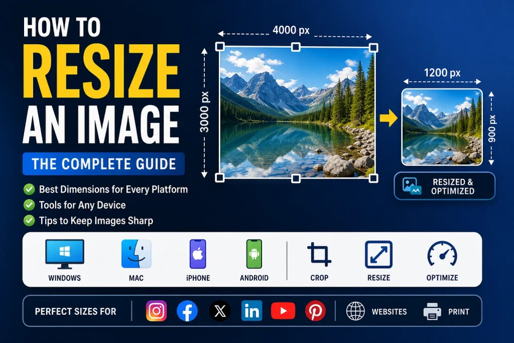
Understanding pixels is the foundation of everything else in this guide. When you resize an image from 4000 × 3000 down to 1200 × 900, you are reducing the total number of pixels in the image. This also reduces the file size because there is simply less data to store. The image takes up less space and loads faster, with the same visual content preserved across a smaller canvas.
What Is Resolution and When Does It Actually Matter?
Resolution refers to pixels per inch — commonly written as PPI — and is primarily relevant for print rather than screens. For digital use on social media, websites, and apps, the PPI value stored in the file metadata does not affect how the image looks on screen at all. What matters for screen display is pixel dimensions only.
For print, resolution matters significantly. The standard for quality print output is 300 PPI. This means a 4 × 6 inch print at 300 PPI needs a source image of at least 1200 × 1800 pixels. Trying to print a 400 × 600 pixel image at that size will produce a visibly blurry, pixelated result. According to the W3C specification on image resolution handling, resolution behaves fundamentally differently between screen rendering and physical print output environments, which is why understanding the distinction saves you from expensive reprinting mistakes.
What Is Aspect Ratio and Why Does It Matter So Much?
Aspect ratio is the proportional relationship between an image’s width and height. A 1:1 ratio is a perfect square. A 16:9 ratio is the standard widescreen format used by most screens, YouTube thumbnails, and video content. A 4:5 ratio is what Instagram recommends for portrait feed posts.
When you resize an image and change the aspect ratio at the same time without cropping, you stretch or squash the image and distort everything in it. People look unnaturally tall or wide, circles become ovals, and the whole image looks wrong and unprofessional. The correct workflow when changing aspect ratio is to crop the image to the target ratio first, then resize it to the exact pixel dimensions needed. Never try to squeeze a wide image into a tall frame by stretching — always crop first.
How to Resize an Image Online — The Fastest Method for Any Device
The fastest way to resize an image to exact pixel dimensions is using a free online tool. No software installation, no account, no cost. It works on Windows, Mac, iPhone, Android, and Chromebook equally well — just open a browser and you are ready.
Using our free Image Resizer takes only a few steps:
- Go to the Image Resizer tool
- Click upload or drag and drop your image into the area
- Enter your target width and height in pixels
- Make sure the aspect ratio lock is enabled if you do not want to distort the image
- Click Resize
- Download your resized image
You can also upload multiple images at once if you have a batch that all need the same dimensions. The tool processes them together and lets you download all resized versions in one go — no need to go through the process one image at a time.
Pros of resizing online:
- Works on any device without installing anything
- Precise pixel-level dimension control
- Supports batch uploads for multiple images
- No watermarks, no sign-up, completely free
- Fast — most images process in seconds
Cons of resizing online:
- Requires an internet connection
- Not ideal for very large batches of high-resolution images where a desktop workflow may be faster
How to Resize an Image on Windows
Using Paint on Windows
Paint is already installed on every Windows computer and works for basic resizing without any extra software. It is not the most powerful option but it handles straightforward resizing tasks well.
- Right-click the image and select Open with > Paint
- Click the Resize button in the top toolbar
- Select Pixels instead of Percentage in the resize dialog
- Enter your target width — make sure Maintain aspect ratio is checked so the height adjusts automatically
- Click OK
- Go to File > Save As and choose your preferred format
Pros: Already installed on all Windows computers, free, works offline, simple for single images
Cons: No quality control settings, no batch processing, limited format options, produces rougher results than dedicated tools on complex resizes
Using the Windows 11 Photos App
Windows 11 has a more user-friendly resize option built into the Photos app that gives slightly more control than Paint.
- Open the image in the Windows Photos app
- Click the three-dot menu at the top right
- Select Resize image from the dropdown
- Choose from preset size options or enter a custom width in pixels
- Save the resized version
This is more approachable than Paint for everyday users but still lacks the precision and format control of a dedicated online tool. For exact platform-specific dimensions, the online Image Resizer gives you more reliable results with less guesswork.
How to Resize an Image on Mac
Using Preview on Mac
Preview is one of the most capable built-in image tools on any operating system. For resizing, it gives you precise pixel control, resolution settings, and format export options — all for free without installing anything extra.
- Open the image in Preview — double-click or right-click and select Open With > Preview
- Go to Tools > Adjust Size in the top menu
- Make sure the chain link icon between width and height is locked — this maintains the aspect ratio
- Enter your target width or height in pixels — the other dimension will adjust automatically
- Check the resolution setting — 72 PPI for screen use, 300 PPI for print
- Click OK
- Go to File > Export and save in your chosen format
Pros: Built into every Mac, free, supports multiple export formats, precise pixel and resolution control
Cons: No quality compression slider for JPG export (limited control over output file size), batch resizing requires selecting multiple files manually
Batch Resizing Multiple Images on Mac Using Preview
Preview has an underused batch resize feature that most Mac users never discover. To resize multiple images at the same time, open all the images in Preview together, select them all in the thumbnail sidebar on the left side, then go to Tools > Adjust Size. The dimension change applies to every selected image simultaneously. This is the fastest free batch resize option on Mac and requires no additional software at all.
How to Resize an Image on iPhone
iPhones do not have a built-in resizing tool that accepts specific pixel dimensions. The Photos app allows cropping and basic aspect ratio adjustments, but there is no way to enter an exact target width of 1080px or 1200px directly on the device.
For precise resizing on iPhone, the browser-based approach is the most practical solution. Open Safari, go to our free Image Resizer, upload your image from Photos, enter your target dimensions in pixels, and download the resized result to your Files app. The whole process takes under a minute and works on all iPhone models without any app download or sign-up.
How to Resize an Image on Android
Android has a similar limitation — most built-in gallery apps allow cropping and basic adjustments but do not offer precise pixel-dimension control for resizing. Some manufacturer apps like Samsung Gallery include a resize option, but it typically offers percentage-based sizing rather than specific pixel targets, which is not useful when you need exact platform dimensions.
For precise pixel-level resizing on Android, open Chrome, go to the online Image Resizer, upload your image from the gallery, enter your target dimensions, and download the resized file to your Downloads folder. This works on every Android device regardless of brand or Android version.
Best Image Sizes for Every Major Platform
This is the most practically useful part of this guide. Platform-specific dimensions are the single biggest thing most people get wrong with images, and getting them right makes an immediate visible difference to how your content looks.
Instagram Image Sizes
Instagram is one of the most unforgiving platforms for incorrectly sized images. It has specific ratios for different post types and aggressively crops anything that falls outside those ratios — often cutting off faces, products, or important parts of your composition without warning.
Instagram Feed Posts
- Square post: 1080 × 1080 px (1:1 ratio) — the safest and most consistent option across all devices
- Portrait post: 1080 × 1350 px (4:5 ratio) — takes up significantly more screen real estate in the feed, which generally leads to better engagement
- Landscape post: 1080 × 566 px (1.91:1 ratio) — good for wide shots and panoramic images
Instagram Stories and Reels
- Stories and Reels: 1080 × 1920 px (9:16 ratio) — full-screen vertical format
- Keep critical content like text and faces within the central 1080 × 1420 px safe zone to avoid Instagram’s UI elements covering important parts of your image
Instagram Profile Picture
- Minimum upload size is 320 × 320 px, but uploading at 800 × 800 px gives noticeably sharper results because Instagram scales it down from a higher starting point
- Instagram displays profile pictures as a circle — always keep your main subject perfectly centred
Key Instagram tip: Instagram recompresses images on upload. Exporting at sRGB colour profile and keeping file size under 1MB before uploading results in significantly less compression damage. Choosing the right format before uploading also helps — our article on how to convert JPG to PNG explains which format holds up better through heavy platform compression.
Facebook Image Sizes
Facebook displays images differently across desktop, mobile, and the Facebook app, which makes some of its image areas — particularly the cover photo — genuinely tricky to optimise for all views simultaneously.
- Shared image post: 1200 × 630 px — displays well in both desktop and mobile feed
- Square post: 1080 × 1080 px — consistent across all devices and feed types
- Profile picture: Upload at 400 × 400 px minimum, 800 × 800 px recommended for sharpness — displayed as a circle
- Cover photo: 820 × 312 px on desktop, 640 × 360 px on mobile — design with both crops in mind and keep important content away from the far edges and top/bottom corners
Twitter and X Image Sizes
- Single image tweet: 1600 × 900 px (16:9 ratio) — displays in full in the timeline without cropping on most devices
- Profile picture: 400 × 400 px — displayed as a circle
- Header/Banner image: 1500 × 500 px — keep important content away from all edges as this image crops differently on mobile versus desktop
LinkedIn Image Sizes
LinkedIn is a professional platform where image quality expectations are higher than on casual social networks. A blurry or badly cropped profile picture or banner on LinkedIn directly affects how professional your presence looks to potential clients, employers, and collaborators.
- Personal profile picture: Upload at 800 × 800 px for sharpest display — shown as a circle, keep subject centred
- Profile background banner: 1584 × 396 px
- Company logo: 300 × 300 px
- Company page cover image: 1128 × 191 px — this is a very wide and short banner, design specifically for this unusual ratio
- Single image post: 1200 × 627 px — works well across both desktop and mobile LinkedIn feeds
YouTube Image Sizes
YouTube Thumbnails
YouTube thumbnails are one of the most important images in digital content. They directly determine whether someone clicks on your video or scrolls past it. A well-designed, correctly sized thumbnail can double click-through rates on identical videos.
- Video thumbnail: 1280 × 720 px (16:9 ratio) — always use this exact size
- Keep file size under 2MB
- Design with bold text, high contrast, and a clear subject that reads well even at very small sidebar sizes
YouTube Channel Art and Profile
- Channel banner/art: 2560 × 1440 px — displays across TV (full width), desktop (central portion), tablet, and mobile
- Keep critical content within the central 1546 × 423 px safe zone to ensure it is visible across all device types
- Profile picture: 800 × 800 px — displayed as a circle across the entire YouTube platform
Pinterest Image Sizes
Pinterest is a vertical-first platform where tall images consistently outperform square and landscape formats. The feed is designed for tall pins and shorter images simply get less screen space and less attention.
- Standard pin: 1000 × 1500 px (2:3 ratio) — the proven sweet spot for Pinterest performance
- Long pin: Up to 1000 × 2100 px — can perform well but Pinterest may truncate very long images in the feed preview
- Profile picture: 165 × 165 px
Website and Blog Image Sizes
Website images require a different mindset to social media. The goal is not just the right pixel dimensions — it is also keeping file sizes as small as possible to protect page loading speed without any visible quality loss.
- Full-width hero or banner image: 1920 × 1080 px — covers most screen widths comfortably
- Blog post featured image: 1200 × 628 px — also doubles as the Open Graph image used when the article is shared on social media
- In-content blog images: 800 × 600 px or 1200 × 800 px depending on your content column width
- eCommerce product images: 800 × 800 px to 2000 × 2000 px depending on whether your store supports zoom functionality
After resizing website images to the correct dimensions, always run them through our Image Compressor to reduce file size before uploading. A 1200 × 800 px image at full quality can easily be 2–3MB. Properly compressed, the same image at identical visual quality can be under 200KB. That difference in loading speed is significant for both user experience and search rankings.
Email Image Sizes
- Email header or banner: 600 × 200 px — the standard email content width is 600px, images wider than this break layouts in many email clients
- Inline email images: Maximum 600 px wide, height flexible depending on content
- Email signature logo: 100 to 300 px wide depending on context — always compress these to keep email file sizes small
WhatsApp Image Sizes
- Shared image: WhatsApp compresses all shared images aggressively regardless of your original size. Starting with a higher resolution — around 1600 × 1600 px maximum — gives you slightly better results after WhatsApp’s compression
- Profile picture: 500 × 500 px — displayed as a circle, keep the main subject centred

Image Size Quick Reference Table
| Platform | Image Type | Recommended Size | Aspect Ratio |
|---|---|---|---|
| Square Post | 1080 × 1080 px | 1:1 | |
| Portrait Post | 1080 × 1350 px | 4:5 | |
| Stories/Reels | 1080 × 1920 px | 9:16 | |
| Profile Picture | 800 × 800 px | 1:1 | |
| Feed Post | 1200 × 630 px | 1.91:1 | |
| Cover Photo | 820 × 312 px | ~2.63:1 | |
| Profile Picture | 800 × 800 px | 1:1 | |
| Twitter/X | Feed Image | 1600 × 900 px | 16:9 |
| Twitter/X | Header Banner | 1500 × 500 px | 3:1 |
| Post Image | 1200 × 627 px | 1.91:1 | |
| Profile Banner | 1584 × 396 px | 4:1 | |
| YouTube | Video Thumbnail | 1280 × 720 px | 16:9 |
| YouTube | Channel Banner | 2560 × 1440 px | 16:9 |
| Standard Pin | 1000 × 1500 px | 2:3 | |
| Website | Hero Image | 1920 × 1080 px | 16:9 |
| Website | Blog Featured | 1200 × 628 px | 1.91:1 |
| Header Banner | 600 × 200 px | 3:1 | |
| Shared Image | 1600 × 1600 px | 1:1 | |
| Print 4×6 inch | Photo Print | 1800 × 1200 px | 3:2 |
How to Resize an Image Without Losing Quality
The Truth About Making Images Larger
This is the part most guides gloss over. When you increase an image beyond its original pixel dimensions, you are asking the software to invent pixel data that was never captured. The image has a fixed amount of information — stretching it across more pixels forces the software to interpolate, creating new pixels by guessing what should be there based on surrounding colours. The result is almost always a softer, blurrier image than the original.
No tool — free or paid — can genuinely add detail to an image by making it larger. AI upscaling tools make educated guesses about what those extra pixels should look like, and for some images this works reasonably well. For others it produces unnatural smoothness or visible artefacts. The practical rule is always the same: work from the highest resolution source you have and resize down, never up. Scaling down always preserves quality better than scaling up.
Key Practices for Sharp Resized Images
- Always resize down from the largest available source — never try to enlarge a small image to fill a large space
- Keep the aspect ratio locked — resizing without maintaining ratio distorts everything in the image
- Choose the right output format — PNG for graphics, logos, and transparent images; JPG for photographs; WebP for web use where speed matters
- Resize once and stop — every time you open, edit, and save a JPG file, it loses a little more quality due to lossy compression. Resize once, keep the original untouched, and do not repeat the process unnecessarily
- Check sharpness at 100% zoom — always view the resized image at actual pixel size before downloading to check that edges and details are still sharp
Format Choice After Resizing Matters as Much as Dimensions
Resizing to the right dimensions but saving in the wrong format wastes the effort. A resized logo or graphic saved as JPG picks up compression artefacts around sharp edges and text. A resized photograph saved as PNG creates an unnecessarily large file that slows down loading. For web images, converting to WebP after resizing gives the smallest file size with the least visible quality loss. Our guide on How to convert JPG to WebP covers the WebP format and its real-world advantages in full detail.
Resizing for Print vs Screen — Understanding the Key Difference
Screen Images — Pixel Dimensions Only
For all screen use — social media, websites, apps, presentations — only the pixel dimensions matter. The PPI value stored in the image file metadata has zero effect on how the image looks on a screen. A 1200 × 800 image looks completely identical on screen whether it is tagged as 72 PPI or 300 PPI. Focus on pixel dimensions alone for anything displayed digitally.
Print Images — Both Dimensions and Resolution Together
For print, pixel dimensions and resolution work together. The formula is straightforward:
Print size in inches × required PPI = minimum pixel dimensions needed
A 6 × 4 inch print at 300 PPI needs at least 1800 × 1200 pixels. A business card at 3.5 × 2 inches at 300 PPI needs at least 1050 × 600 pixels. Sending an image to a print service that is too small for the requested print size results in a visibly blurry or pixelated physical print. Always confirm the minimum resolution requirements with your print service before preparing files — professional services specify these clearly.
For large-format prints like exhibition banners or outdoor signage that are viewed from greater distances, 150 PPI is often acceptable and sometimes preferred to keep file sizes manageable.
Common Image Resizing Mistakes to Avoid
Most resizing problems come from a small number of consistently repeated mistakes. Understanding these saves you time and prevents frustrating results.
- Resizing up instead of down — Enlarging a small image never adds real detail. Always start from the largest version available.
- Not locking the aspect ratio — Resizing with a free width and height independently distorts everything in the image. Always lock the ratio unless you are intentionally squashing or stretching for a creative effect.
- Forgetting to crop first — If the target dimensions require a different aspect ratio, always crop to the correct ratio before resizing. Never squeeze a wide image into a tall frame.
- Saving as JPG multiple times — Each open-edit-save cycle on a JPG degrades quality slightly. Always keep the original file untouched and export the resized version as a new file.
- Ignoring file size after resizing — Correct pixel dimensions do not automatically mean a web-ready file size. Always compress after resizing for web use.
- Not checking the output at 100% zoom — Small sharpness issues are invisible at 25% zoom but obvious at full size. Always verify the result before using the image.
Frequently Asked Questions
1. What is the best image size for all social media platforms?
There is no single size that works perfectly everywhere. The closest universal option is 1200 × 630 px, which works well for Facebook and LinkedIn posts and as the Open Graph image when sharing web pages. For platforms with specific requirements like Instagram Stories at 1080 × 1920 px or YouTube thumbnails at 1280 × 720 px, you need to resize specifically for each platform individually.
2. Does resizing an image reduce quality?
Resizing down — making an image smaller — has minimal impact on quality when done correctly. Resizing up — making an image larger than its original dimensions — always reduces quality because the software must invent pixel data that does not exist. The practical rule is always resize down from the largest source available.
3. What is the difference between resizing and cropping?
Resizing changes the pixel dimensions of the whole image proportionally. Cropping removes parts of the image to change the composition and aspect ratio while keeping the resolution of the remaining area intact. For fitting a specific platform aspect ratio, crop first to get the right ratio, then resize to the exact pixel dimensions needed.
4. Should I resize images before uploading to social media?
Yes, always. When you upload an oversized image, the platform automatically recompresses it using an algorithm that prioritises server efficiency over image quality. Resizing to the exact recommended dimensions before uploading gives the platform less reason to aggressively compress your image, and the result is visibly sharper.
5. What resolution do I need for printing?
300 PPI is the professional standard for print. Calculate required pixel dimensions by multiplying print size in inches by 300. A 5 × 7 inch print needs at least 1500 × 2100 pixels. For large format prints viewed from a distance, 150 PPI is often sufficient.
6. How do I resize an image without stretching it?
Enable the aspect ratio lock in whatever resize tool you are using. This is usually a chain link icon or a checkbox labelled Maintain Aspect Ratio. When enabled, changing the width automatically adjusts the height proportionally. If your target dimensions require a different ratio to the original image, crop first and then resize.
7. What is the best format to save a resized image in?
For photographs and most social media images, JPG at high quality works well. For images with transparency, sharp text, or logos, use PNG. For web images where loading speed matters, converting to WebP after resizing gives the best balance of small file size and good visual quality. If you work with logos or graphics that need to scale to any size without resizing, our guide on how to convert JPG to SVG covers vector formats that eliminate the need for resizing entirely.
8. How do I reduce the file size of an image after resizing?
Resizing down automatically reduces file size by removing pixels. But for web use you often need to go further. After resizing, run the image through our Image Compressor to reduce file size further without any visible quality loss. This is essential for website images where loading speed affects both user experience and search performance.
9. Why does my resized image look blurry?
This happens for three main reasons. You resized the image up beyond its original dimensions. You saved as JPG at a low quality setting which introduces compression blur around edges. Or you started with a low-resolution image that did not have enough detail to fill the target size. Always start with the highest resolution original and resize down.
10. Can I resize multiple images at once?
Yes. Our free Image Resizer supports multiple file uploads so you can process a batch of images all at the same dimensions in one go. On Mac, Preview also supports batch resizing natively — open all images together, select all in the sidebar, and apply the resize to all simultaneously.
Conclusion
Image resizing is one of those tasks that seems minor but has a real, visible impact on how professional your content looks across every platform and context. Uploading at the wrong size leads to platform recompression, unexpected cropping, blurry results, and slow-loading pages — all of which are completely avoidable with a few minutes of preparation upfront.
The rules that matter most: always resize down from the highest resolution source you have, always lock the aspect ratio unless you are intentionally cropping, choose the right output format for the use case, and compress images for web use after resizing to keep file sizes manageable.
Use the platform dimension table in this guide as your permanent reference for social media and web images. And when you are ready to resize, our free Image Resizer handles single images and batches equally well — no software, no sign-up, sharp results every time.