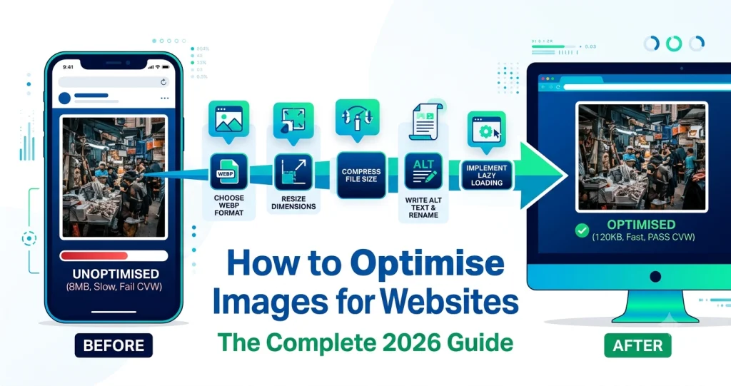
Images make up more than 50% of the average webpage’s total size — and unoptimised images are the single biggest reason most websites load slowly. A slow website loses visitors, ranks lower on Google, and scores badly on Core Web Vitals. The good news is that fixing your images is one of the easiest and highest-impact things you can do for your website right now.
This guide covers everything about image optimisation in 2026. What it means, why it matters for SEO, how to pick the right format, how to resize and compress correctly, and how to implement everything step by step — no technical background needed.
What Is Image Optimisation and Why Does It Matter?
Image optimisation means preparing your images so they load as fast as possible without looking any worse to your visitors. It involves picking the right file format, resizing to correct dimensions, compressing file sizes, and delivering images efficiently.
Most people upload photos straight from their phone or camera to their website. A smartphone photo is typically 3 to 8MB and several thousand pixels wide. Your website column might be 800 pixels wide. So you’re loading a 5MB, 4000-pixel-wide image to display it at 800 pixels. That’s like driving a truck to pick up a sandwich — wasteful and slow.
This wastes bandwidth, slows your pages down, and frustrates visitors. People leave slow websites fast. Google knows this and uses page speed as a direct ranking signal. Fixing your images solves all of this at once.
How Images Affect Google Rankings in 2026
Core Web Vitals — What They Are and Why They Matter
Google measures page experience using metrics called Core Web Vitals. These are real measurements of how fast and smooth your pages feel to real visitors. Images directly affect two of the three main Core Web Vitals scores.
Largest Contentful Paint (LCP) measures how long it takes for the biggest visible element on the page to load. On most websites, that biggest element is an image — a hero image, featured image, or large product photo. When that image is large and unoptimised, your LCP score tanks. Google wants LCP under 2.5 seconds. Most unoptimised websites fail this test badly.
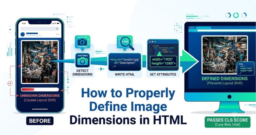
Cumulative Layout Shift (CLS) measures how much the page jumps around while loading. When images load without defined dimensions, they push other content around as they appear. This creates a jarring experience and hurts your CLS score. Always define width and height on your image tags to prevent layout shifts.
According to Google’s Core Web Vitals documentation, pages that pass Core Web Vitals get a boost in search rankings compared to pages that fail. Image optimisation is the single biggest lever for improving these scores on most websites.
Google Image Search Traffic
Optimised images also rank better in Google Image Search. When your images load fast, have descriptive file names, and include proper alt text, Google understands them better and shows them more often in image search results. This brings extra traffic to your website that most site owners completely ignore.
Proper image optimisation is not just about speed — it’s also about discoverability. Every image on your website is an opportunity to rank for a relevant search query if you handle it correctly.
Step 1 — Choose the Right Image Format
Why Format Choice Is the First Decision
The format you save your image in has a bigger impact on file size than almost anything else. Picking the wrong format can make your image 3 to 5 times larger than it needs to be — before you’ve even thought about compression. Getting the format right first makes every other optimisation step easier and more effective.
In 2026, you have four main formats to choose from for web images — JPG, PNG, WebP, and SVG. Each one has a specific job. Using the right format for the right image type is the foundation of good image optimisation.
JPG — Best for Photographs
JPG is the right choice for photographs and complex images with lots of colour gradients. It uses lossy compression that removes some image data to create small file sizes. At quality settings of 80 to 85 percent, JPG images look identical to the original on screen while being significantly smaller than uncompressed versions.
JPG is not good for images with sharp edges, text, logos, or transparent backgrounds. These image types show compression artefacts — blurry edges and colour fringing — that look bad at any file size. Use PNG or WebP for those instead.
PNG — Best for Graphics and Transparency
PNG uses lossless compression — it keeps every pixel of the original image intact. This makes PNG the right choice for logos, icons, screenshots, images with text, and anything with a transparent background. PNG files are larger than JPGs for photographic content, but for graphics with flat colours and sharp edges, PNG looks much sharper than JPG at a similar file size.
If your image has a transparent background — like a logo or a product cutout — PNG is your go-to format. JPG cannot store transparency at all and will fill transparent areas with white automatically.
WebP — Best for Everything on the Web
WebP is the most efficient format for web use in 2026. It produces files that are 25 to 35 percent smaller than PNG and 25 to 34 percent smaller than JPG at the same visual quality. WebP supports transparency like PNG, lossy compression like JPG, and animation like GIF — all in one format.
Every modern browser supports WebP — Chrome, Firefox, Safari, Edge, and Opera. Global WebP browser support is now over 96 percent. For any image going on a web page, WebP is almost always the smartest choice. Our guide on what is WebP format explains how WebP works and why it’s the best choice for web images in 2026.
SVG — Best for Logos and Icons
SVG is a vector format — it uses mathematical paths instead of pixels. This means SVG images scale to any size without ever getting blurry. SVG is perfect for logos, icons, and simple illustrations that need to look sharp on screens of all sizes from a small phone to a large 4K monitor.
SVG files are also tiny for simple graphics. A logo that’s 200KB as a PNG might be 5KB as an SVG. Use SVG for any graphic that is built from shapes and paths rather than photographic content.
Quick Format Decision Guide
| Image Type | Best Format |
|---|---|
| Photograph | WebP or JPG |
| Logo | SVG or WebP |
| Icon | SVG or WebP |
| Screenshot | WebP or PNG |
| Transparent background | WebP or PNG |
| Animation | WebP |
| Print use | PNG or JPG |
| Illustration | SVG or WebP |
Step 2 — Resize Images to the Correct Dimensions
Why Dimensions Matter as Much as Format
Choosing the right format is step one. But even a perfectly formatted WebP image can still be massive if the pixel dimensions are wrong. A 4000px wide image displayed in an 800px wide column is loading 25 times more pixels than needed. The browser downloads all that extra data and then throws it away when it shrinks the image to fit. This wastes your visitor’s bandwidth and slows your page down significantly.
Always resize images to the actual display dimensions before uploading. Not approximately — exactly. If your blog content column is 1200px wide, resize your images to 1200px wide before uploading. If your product images display at 800 × 800px, resize to exactly 800 × 800px. This single step can reduce image file sizes by 60 to 80 percent before you’ve even applied any compression.
Correct Dimensions for Common Website Elements
Here are the right dimensions for the most common website image types:
| Element | Recommended Size |
|---|---|
| Hero/Banner image | 1920 × 1080px |
| Blog featured image | 1200 × 628px |
| Blog inline image | 800 × 600px |
| Product image | 800 × 800px to 1200 × 1200px |
| Logo | Use SVG — or 200 to 400px wide PNG/WebP |
| Thumbnail | 400 × 300px |
| Background image | 1920 × 1080px |
| Open Graph image | 1200 × 630px |
How to Resize Images Before Uploading
Resizing is simple and free. On Mac, open the image in Preview, go to Tools > Adjust Size, enter the target width, make sure the aspect ratio is locked, and save. On Windows, open in Paint, click Resize, select Pixels, enter your target width, and save.
For the fastest and most accurate resizing on any device, our Image Resizer lets you enter exact pixel dimensions and download the resized image instantly — no software needed. You can also upload multiple images at once to resize them all in one go.
Don’t Forget Retina Screens
Retina and high-DPI screens display images at double the pixel density. A 400px wide image on a retina screen looks blurry because the screen is trying to display it at 800px. For important images like hero sections and product photos, upload at 2x the display size — so a 1200px wide hero image should be uploaded at 2400px if you want it to look sharp on retina displays.
This does increase file size, which is why combining retina-sized images with proper compression and WebP format is important. You get the sharpness without the performance penalty.
Step 3 — Compress Your Images
What Compression Does and Why It’s Not Optional
Resizing gets your image to the right dimensions. Compression gets the file size down to the right number of bytes. Even a correctly sized image can still be too large if it hasn’t been compressed. A 1200 × 628px JPG saved at maximum quality from Photoshop can easily be 800KB to 1.5MB. The same image properly compressed sits under 150KB — with no visible difference on screen.
Compression works by removing image data that the human eye is unlikely to notice. At quality settings of 75 to 85 percent, the removed data is truly invisible at normal viewing sizes. You get a dramatically smaller file that looks identical to the original. This is not a tradeoff — it’s just smart file management.
Lossy vs Lossless Compression — Which to Use
Lossy compression removes some image data permanently to achieve smaller sizes. It’s ideal for photographs and complex images where tiny quality reductions are invisible. JPG and lossy WebP use lossy compression. Set quality between 75 and 85 percent for the best balance of size and quality.
Lossless compression reorganises image data more efficiently without removing anything. The image stays pixel-perfect. PNG and lossless WebP use lossless compression. Use lossless for logos, icons, screenshots, and anything with text or sharp edges where compression artefacts would be noticeable.
Target File Sizes for Web Images
These are the file sizes to aim for when optimising images for web use:
| Image Type | Target File Size |
|---|---|
| Hero/Banner image | Under 200KB |
| Blog featured image | Under 150KB |
| Blog inline image | Under 100KB |
| Product image | Under 150KB |
| Thumbnail | Under 30KB |
| Logo/Icon | Under 20KB |
| Background image | Under 300KB |
How to Compress Images Correctly
The fastest way to compress images on any device is using a free online tool. Our Image Compressor reduces image file sizes by up to 80 percent without any visible quality loss. Upload your image, download the compressed version, done. You can upload multiple images at once for batch compression.
For more detail on compression methods and how they work, our article on how to compress an image covers everything in depth — including what happens to quality at different compression levels and common mistakes to avoid.
Step 4 — Convert Images to WebP
Why WebP Is the Standard for Web Images in 2026
If you’re still serving JPG and PNG images on your website in 2026, you’re leaving a lot of performance on the table. WebP is now the standard for web image delivery. It’s smaller than JPG and PNG, it’s supported by every modern browser, and Google actively recommends it in PageSpeed Insights as a high-priority improvement.
Converting your existing images to WebP is one of the most effective single changes you can make to improve your website’s loading speed. The file size reductions are real and immediately measurable — and they add up across every page and every image on your site.
How to Convert JPG Images to WebP
Converting JPG images to WebP is simple and free. Use our JPG to WebP converter — upload your JPG files, download the WebP versions. You can process multiple files at once. The output is smaller than the JPG input with no visible quality difference at normal viewing sizes.
For a full understanding of what changes when you convert from JPG to WebP and what to expect from the results, our article on how to convert JPG to WebP walks through the whole process with tips for getting the best output quality.
How to Convert PNG Images to WebP
PNG to WebP conversion works just as well and gives even bigger file size reductions for photographic PNG content. Use our PNG to WebP converter to convert any PNG file to WebP — single files or batches. Transparent PNGs convert to transparent WebP files, so you don’t lose transparency in the process.
Our article on how to convert PNG to WebP covers lossless vs lossy WebP conversion for PNG files and explains which setting to use for different image types.
Implementing WebP on Your Website
Once you have WebP images, you need to serve them correctly. For WordPress users, WebP images can be uploaded directly to the media library in WordPress 5.8 and later — just upload the WebP file and use it like any other image.
For custom HTML websites, use the HTML <picture> element to serve WebP with a JPG or PNG fallback for the small percentage of users on older browsers:
html
<picture>
  <source srcset="image.webp" type="image/webp">
  <img src="image.jpg" alt="Description of image">
</picture>
This serves WebP to browsers that support it and automatically falls back to JPG for those that don’t. Every visitor gets the best image their browser can handle.
Step 5 — Write Proper Alt Text for Every Image
What Alt Text Is and Why It Matters
Alt text is a short text description you add to every image on your website. It serves two important purposes. First, it tells Google what your image shows — Google’s crawlers can’t see images the way humans do, so they rely on alt text to understand image content. Second, it displays in place of the image if the image fails to load, and it’s read aloud by screen readers for visually impaired users.
Many website owners either skip alt text entirely or write lazy alt text like “image1.jpg” or “photo”. Both approaches waste a real SEO opportunity. Every image on your website is a chance to rank for a relevant keyword in Google Image Search and to reinforce the topic of the page to Google’s crawlers.
How to Write Good Alt Text
Good alt text is specific, accurate, and natural. It describes what is actually in the image in plain language — not keyword-stuffed, not vague. Here are some examples:
Bad alt text:
image1.jpgphotoSEO image optimisation website speed compression JPG PNG WebP
Good alt text:
Screenshot showing Google PageSpeed Insights score before and after image optimisationComparison of JPG PNG and WebP file sizes for the same photographWebsite loading speed test results showing 2.1 second load time
Keep alt text under 125 characters. Include your target keyword naturally if it fits — but only if it genuinely describes the image. Never stuff keywords into alt text just for SEO. Google is smart enough to tell the difference and it can hurt your rankings.
When to Leave Alt Text Empty
Decorative images that don’t add any information to the page — dividers, background patterns, purely aesthetic graphics — should have empty alt text (alt=""). This tells screen readers to skip the image and tells Google it’s decorative. Don’t leave the alt attribute out entirely — always include alt="" for decorative images.
Step 6 — Use Descriptive File Names
Why File Names Are an Overlooked SEO Signal
Most people upload images with file names like IMG_4829.jpg or screenshot-2024-11-03.png. These file names tell Google absolutely nothing about the image content. Google reads file names as part of understanding what an image shows — a descriptive file name is a small but real SEO signal.
Rename your images before uploading. Use descriptive, keyword-relevant names that accurately describe the image. Use hyphens to separate words — not underscores and not spaces.
Bad file names:
IMG_4829.jpgscreenshot001.pngimage_final_v3.webp
Good file names:
jpg-to-webp-conversion-comparison.webpwebsite-image-optimisation-checklist.webpproduct-photo-white-background.webp
Keep file names short and accurate. Include one or two relevant keywords that genuinely describe what the image shows. Don’t stuff five keywords into a file name — it looks spammy and Google ignores it.
Step 7 — Define Image Dimensions in Your HTML
Why Missing Dimensions Hurt Performance
When a browser loads your webpage, it starts rendering content immediately — before all the images have finished loading. If your images don’t have defined width and height attributes in your HTML, the browser doesn’t know how much space to reserve for them. When the images finally load, they push all the content below them downward, causing the page to jump around.
This is called layout shift and it’s measured by Google as Cumulative Layout Shift (CLS) — one of the Core Web Vitals metrics. High CLS scores hurt both user experience and search rankings. Defining image dimensions in your HTML prevents layout shifts and improves your CLS score.
How to Add Dimensions to Image Tags
Always include width and height attributes on your <img> tags:
html
<img src="product-photo.webp" alt="Blue running shoes on white background" width="800" height="800">For responsive images that scale with the browser window, also add height: auto in your CSS so the image scales proportionally:
css
img {
  max-width: 100%;
  height: auto;
}
This combination — HTML dimensions plus CSS max-width — gives you images that are both properly sized for layout calculations and fully responsive on all screen sizes.
Step 8 — Use Lazy Loading
What Lazy Loading Is and Why It Helps
Lazy loading is a technique that stops images from loading until the user actually scrolls down to where they appear on the page. Instead of loading every image on the page when someone visits — including images far below the fold that the visitor may never scroll to — lazy loading loads images only when they’re about to become visible.
This dramatically reduces the amount of data loaded on initial page visit. For long pages with many images — like blog posts, product category pages, or portfolio pages — lazy loading can cut initial load times in half.
How to Enable Lazy Loading
Adding lazy loading to your images in 2026 is simple. Just add the loading="lazy" attribute to your image tags:
html
<img src="blog-image.webp" alt="Description" width="1200" height="628" loading="lazy">That single attribute tells the browser to defer loading the image until the user scrolls near it. No JavaScript required — it’s a native browser feature supported by all modern browsers.
Important: Do not add lazy loading to images that appear above the fold — your hero image, logo, or any image visible without scrolling. These images should load immediately. Only apply lazy loading to images below the fold. Adding lazy loading to above-fold images actually hurts your LCP score.
Step 9 — Use an Image CDN or Caching
What a CDN Does for Images
A Content Delivery Network (CDN) stores copies of your images on servers around the world. When a visitor loads your page, the images are served from the server closest to their physical location rather than from your main server. This reduces the distance data has to travel and speeds up image loading for visitors everywhere.
For websites with visitors from multiple countries, a CDN can significantly reduce image loading times for international visitors. Most major CDN providers also apply automatic image optimisation — compression, format conversion, and resizing — on the fly as images are delivered.
Browser Caching for Images
Browser caching tells visitors’ browsers to store your images locally after the first visit. On subsequent visits, the browser loads images from its local cache instead of downloading them from your server again. This makes repeat visits dramatically faster.
Set cache headers for your images to a long duration — at least one year for static images that don’t change. In Apache, add this to your .htaccess file:
apache
<IfModule mod_expires.c>
  ExpiresActive On
  ExpiresByType image/webp "access plus 1 year"
  ExpiresByType image/jpeg "access plus 1 year"
  ExpiresByType image/png "access plus 1 year"
</IfModule>
This tells browsers to cache your images for a full year, which means returning visitors load your pages almost instantly because all the images are already stored locally.
Step 10 — Test and Measure Your Results
How to Check If Your Image Optimisation Is Working
After optimising your images, you need to measure the results to confirm the improvements are real and to identify any remaining issues. There are several free tools that give you detailed, actionable reports on your image performance.
Google PageSpeed Insights — Go to pagespeed.web.dev, enter your URL, and run a test. PageSpeed Insights gives you a performance score out of 100 and lists specific image-related issues — oversized images, images in wrong formats, images without lazy loading, and missing dimensions. Fix each issue it identifies and run the test again to confirm improvement.
Google Search Console — Google Search Console shows you Core Web Vitals data for your real visitors. Go to Experience > Core Web Vitals to see how your pages are actually performing for people who visit your site. Pages marked as Poor or Needs Improvement are your priority targets.
GTmetrix — GTmetrix gives you detailed waterfall charts showing exactly how long each image takes to load and what percentage of total page weight images represent. This is useful for identifying which specific images are causing the most problems.
What Good Performance Looks Like
After proper image optimisation, here’s what you should aim for:
| Metric | Target |
|---|---|
| PageSpeed Score (Mobile) | Above 80 |
| PageSpeed Score (Desktop) | Above 90 |
| LCP | Under 2.5 seconds |
| CLS | Under 0.1 |
| Total Image Weight Per Page | Under 500KB |
| Individual Image File Size | Under 200KB |
These targets are achievable for most websites through the steps covered in this guide. If you’re hitting these numbers, your image optimisation is in good shape.
Image Optimisation Checklist for 2026
Use this checklist every time you add images to your website. Going through each point takes about five minutes per image and makes a real difference to your page performance.
- ✅ Resized to correct pixel dimensions for display context
- ✅ Converted to WebP format
- ✅ Compressed to target file size
- ✅ Descriptive file name with relevant keywords
- ✅ Accurate alt text that describes the image
- ✅ Width and height attributes defined in HTML
- ✅ Lazy loading added for below-fold images
- ✅ Tested in PageSpeed Insights after upload
Common Image Optimisation Mistakes to Avoid
Most websites make the same small set of mistakes that undo all their optimisation work. Here’s what to watch for.
Uploading camera photos without resizing. A raw smartphone photo is 3 to 8MB. No web page needs an image that large. Always resize to the correct display dimensions before uploading.
Using PNG for photographs. PNG is lossless which is great for graphics but terrible for photographs in terms of file size. A photograph saved as PNG can be 5 to 10 times larger than the same photograph saved as WebP or JPG. Use WebP or JPG for all photographic content.
Compressing already-compressed images. Every time you open, edit, and re-save a JPG, it loses more quality. Always keep your original files untouched and compress from the original each time you need a web-ready version.
Skipping alt text. Every image without alt text is a missed SEO opportunity. It takes 10 seconds to write good alt text and it makes a real difference to your image search rankings and accessibility.
Adding lazy loading to above-fold images. This is a common mistake that actually hurts performance. Never lazy load your hero image or logo — these need to load immediately. Only lazy load images that appear below the fold.
Not testing after making changes. You can’t know if your optimisation is working without measuring. Run a PageSpeed Insights test before and after optimising to confirm the improvements are real.
Image Optimisation for Different Types of Websites
Blog and Content Websites
For blogs, featured images and inline content images are the main targets. Every blog post typically has one featured image and several inline images. Resize featured images to 1200 × 628px, compress to under 150KB, convert to WebP, and add descriptive alt text. For inline images, resize to your content column width — usually 800 to 1200px — and compress to under 100KB.
If you write long-form articles with many images, lazy loading is especially important. Load the above-fold featured image immediately and lazy load everything else.
eCommerce Websites
Product images are the most critical images on any eCommerce website. They need to look sharp enough to convince visitors to buy while loading fast enough not to lose them before the page finishes loading. Use WebP format for all product images. Keep file sizes under 150KB per image at your display dimensions. If your store supports zoom functionality, provide a 2x resolution version for the zoomed view.
For product category pages with many product images, lazy loading is essential. Loading 50 product images simultaneously would make category pages painfully slow. Lazy loading ensures only the images currently visible on screen are loaded at any one time.
Portfolio and Photography Websites
Photography websites face a unique challenge — the images themselves are the content, so quality is non-negotiable. But high-quality images are also large. The solution is WebP format with a high quality setting — 85 to 90 percent — which gives you excellent visual quality at significantly smaller file sizes than JPG.
For photography portfolios, use a thumbnail grid on listing pages with small, fast-loading thumbnail images. Load full-size images only when a visitor clicks through to view a specific photo. This keeps listing pages fast while still delivering full quality on individual photo pages.
Frequently Asked Questions
1. What is the best image format for websites in 2026?
WebP is the best image format for websites in 2026. It’s 25 to 35 percent smaller than PNG and JPG at the same visual quality, supports transparency, and works in every modern browser. Use WebP for all web images — photographs, graphics, logos, and screenshots. Keep SVG for logos and icons that need to scale to any size without losing quality.
2. How much can image optimisation improve my website speed?
Images typically make up 50 to 70 percent of a webpage’s total size. Properly optimising your images — right format, correct dimensions, good compression — can reduce your total page weight by 60 to 80 percent. Most websites see dramatic improvements in loading times and PageSpeed scores after properly optimising their images.
3. Do I need to optimise images already on my website?
Yes. Any unoptimised images already on your website are slowing it down right now. Audit your existing images using Google PageSpeed Insights or GTmetrix. Both tools identify specific images that are too large, in the wrong format, or missing optimisation. Replace unoptimised images with properly optimised versions for immediate performance improvements.
4. What is the ideal file size for website images?
For most web images, aim for under 150KB. Hero images and large banners can go up to 200 to 300KB if needed. Small thumbnails and icons should be under 30KB. These targets are achievable with proper format choice and compression without any visible quality reduction at normal screen sizes.
5. Does image optimisation help with SEO?
Yes, directly. Page loading speed is a confirmed Google ranking factor and images are the biggest contributor to slow loading times on most websites. Faster pages rank better. Properly optimised images with good alt text and descriptive file names also rank in Google Image Search, bringing additional organic traffic to your website.
6. Should I use JPG or WebP for product images?
WebP. Product images in WebP format are 25 to 34 percent smaller than the same images in JPG format at equivalent visual quality. Smaller files load faster, which reduces bounce rates and improves conversion rates on eCommerce websites. WebP also supports transparency, which is useful for product images on white or transparent backgrounds.
7. How do I check if my images are properly optimised?
Run your website through Google PageSpeed Insights at pagespeed.web.dev. It gives you a detailed list of image-related issues — images that are too large, images in inefficient formats, images missing lazy loading, and images without defined dimensions. Fix each issue it identifies and re-run the test to confirm improvement.
8. What is lazy loading and should I use it?
Lazy loading is a technique that delays loading images until the user scrolls to where they appear on the page. It reduces the amount of data loaded on initial page visit and speeds up page rendering. You should use lazy loading for all images below the fold. Do not use it for above-fold images like your hero image or logo — those need to load immediately.
9. How do I add alt text to images in WordPress?
In WordPress, click on any image in the Media Library and look for the Alt Text field in the right panel. Type a descriptive, accurate description of the image. When you insert an image into a post or page using the Block Editor, click on the image block and find the Alt text field in the settings panel on the right side of the screen.
10. How often should I optimise my images?
Build image optimisation into your workflow so every image is optimised before it gets uploaded. Use a simple checklist — resize, compress, convert to WebP, rename, add alt text — for every image you add to your website. This takes five minutes per image and prevents unoptimised images from accumulating on your site over time.
Conclusion
Image optimisation is not a one-time task — it’s a habit you build into your workflow. Every image you add to your website either helps or hurts your page speed, your Core Web Vitals scores, and your Google rankings. Getting it right from the start is much easier than going back and fixing hundreds of unoptimised images later.
The steps are simple. Choose the right format — WebP for almost everything on the web. Resize to the correct dimensions before uploading. Compress to the target file size. Write descriptive alt text. Define image dimensions in your HTML. Add lazy loading below the fold. Test with PageSpeed Insights and fix what it flags.
Do these ten steps consistently and your website will load faster, rank better, and keep visitors longer than most of your competitors who are still uploading raw camera photos and ignoring their image performance entirely.