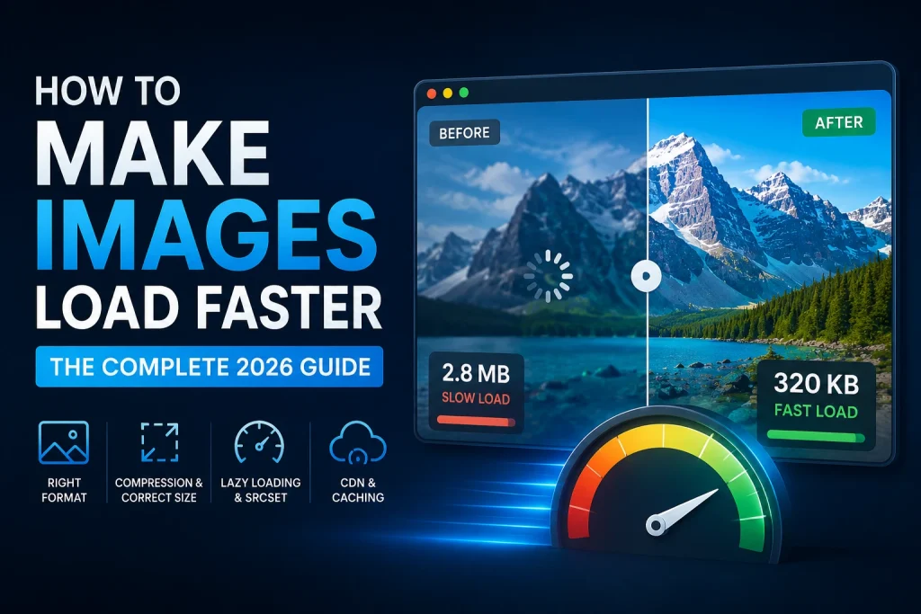
Images account for more than 50 percent of the average webpage’s total download size — making them the single biggest factor in how fast or slow a website feels to real visitors. A one-second delay in page loading reduces conversions by 7 percent according to research by Akamai. A website that loads in 1 second converts 3× better than one that loads in 5 seconds. Every image optimisation technique in this guide directly reduces loading time — and faster loading means better user experience, better Core Web Vitals scores, and better Google search rankings.
This guide covers every technique to make images load faster in 2026 — format conversion, compression, correct dimensions, lazy loading, responsive images with srcset, CDN delivery, browser caching, and next-generation delivery methods — with specific implementation steps for every method and realistic numbers showing how much each improvement saves.
Why Image Loading Speed Matters — The Real Numbers
Image loading speed is not just a technical metric — it directly affects revenue, user experience, and search rankings in measurable ways.
The performance-revenue connection: According to Google’s research on page speed and business impact, every 100ms reduction in loading time increases conversion rates by 1 percent for retail sites. A site generating $100,000 per month that loads 500ms faster generates an additional $6,000 per month — from image optimisation alone.
The abandonment problem: Google’s research shows that 53 percent of mobile users abandon a website if it takes more than 3 seconds to load. Images are the primary cause of slow mobile loading — a single unoptimised hero image can add 2 to 3 seconds to mobile load times on average connections.
The SEO impact: Google uses Core Web Vitals — Largest Contentful Paint, Cumulative Layout Shift, and Interaction to Next Paint — as direct ranking signals. All three are significantly affected by image loading performance. Pages that pass Core Web Vitals assessments rank measurably better than equivalent pages that fail.
The scale of the problem: According to the HTTP Archive Web Almanac, the median webpage transfers approximately 1MB of images on desktop and 850KB on mobile in 2023. For image-heavy sites — eCommerce, photography, news — images commonly account for 70 to 80 percent of total page weight.
Technique 1 — Use the Right Image Format
Why Format Is the Highest-Impact Starting Point
Format choice affects file size more than any other single decision. A photograph saved as PNG instead of WebP can be 5 to 10 times larger — before any compression is applied. Getting the format right first gives you the best possible starting point for all subsequent optimisations.
Format hierarchy for web performance in 2026:
| Format | Best For | Avg File Size vs JPG | Browser Support |
|---|---|---|---|
| WebP | All web images | 25–34% smaller | 96%+ |
| AVIF | Future-forward web | 40–50% smaller | 75%+ |
| JPG | Email, universal compat | Baseline | Universal |
| PNG | Graphics, transparency | 2–5× larger (photos) | Universal |
| SVG | Logos, icons | Tiny | Universal |
| GIF | Animation (legacy) | Large | Universal |
WebP — The Standard for Web Images in 2026
WebP is the correct format for virtually all images on websites in 2026. According to Google’s WebP technical documentation, WebP lossy images are 25 to 34 percent smaller than JPG at equivalent visual quality. WebP lossless images are 26 percent smaller than PNG. WebP supports transparency like PNG and animation like GIF — one format replaces three.
At 96 percent global browser support, WebP is safe to use as the primary format on any website. For the remaining 4 percent on older browsers, implement fallbacks using the HTML picture element.
Converting to WebP: Use our free JPG to WebP converter for photographs and our PNG to WebP converter for graphics. Both support batch upload — convert entire folders of images at once.
File size impact example — a 10-page website with 8 images per page:
| Format | Avg Image Size | Total Page Images | Total per Page |
|---|---|---|---|
| PNG (photos) | 800 KB | 80 | 6.4 MB |
| JPG (80%) | 200 KB | 80 | 1.6 MB |
| WebP (80%) | 130 KB | 80 | 1.04 MB |
Switching from PNG photographs to WebP saves 5.36MB per page — downloaded fresh by every visitor on every visit.
SVG for Logos and Icons
SVG files for simple logos and icons are dramatically smaller than raster equivalents. A logo that is 150KB as PNG might be 3KB as SVG — 50× smaller. SVG also scales to any screen size without quality loss — no need to provide multiple resolutions. Every modern browser supports SVG natively.
For web logos and icons, SVG is almost always the right choice. Our guide on how to convert JPG to SVG covers the conversion process and what to expect from the results.
Technique 2 — Resize Images to Correct Display Dimensions
Why Oversized Images Are a Hidden Performance Killer
Uploading images larger than their display size is one of the most common and most impactful performance problems on websites. A 4000 × 3000 pixel image displayed in an 800 × 600 pixel content column downloads 25 times more pixel data than the browser can actually display. The browser downloads all the excess pixels and then discards them during rendering — wasting bandwidth, slowing download, and increasing browser processing time.
The mathematics of oversized images:
- A 4000 × 3000 pixel JPG at 80% quality: approximately 2.5MB
- An 800 × 600 pixel JPG at 80% quality of the same image: approximately 80KB
- Data wasted: 2.42MB per image load — every load, every visitor
For a website that gets 10,000 page views per month on a page with one oversized hero image, this wastes 24.2GB of unnecessary data transferred per month — and makes the page load significantly slower for every one of those 10,000 visits.
Correct Dimensions for Every Context
Always resize images to match their actual display dimensions before uploading. Use browser developer tools (right-click > Inspect) to find the exact rendered dimensions of any image slot on your website.
| Image Type | Correct Dimensions | Notes |
|---|---|---|
| Full-width hero | 1920 × 1080px | 2× for retina: 3840 × 2160px |
| Blog featured image | 1200 × 628px | Also works as Open Graph |
| Product image (standard) | 800 × 800px | 2× for zoom: 1600 × 1600px |
| Blog inline image | 800–1200px wide | Match content column width |
| Thumbnail | 400 × 300px | 2× for retina: 800 × 600px |
| Background image | 1920 × 1080px | Compress aggressively |
| Email header | 600px wide max | Standard email content width |
How to Resize Images
Our free Image Resizer lets you enter exact pixel dimensions and download correctly-sized images in seconds. Upload multiple images at once for batch resizing. Always maintain the aspect ratio when resizing — changing one dimension without proportionally adjusting the other distorts the image.
Performance impact of correct sizing:
A website with 10 blog posts each containing 5 inline images uploaded at camera resolution (4000px wide) vs correct display dimensions (1200px wide):
- Camera resolution: 5MB per image × 50 images = 250MB total image payload
- Correct dimensions: 150KB per image × 50 images = 7.5MB total image payload
- Reduction: 242.5MB — from dimension correction alone, before any compression
Technique 3 — Compress Images to Target File Sizes
Why Compression Is Not Optional for Web Images
The images may also be too big even when they are formatted correctly and at the right size. Cameras usually capture images at maximum quality; this is more than what is required on websites. Lowering the image quality to between 75% and 85% decreases the file size by 60% to 80%. This results in no difference in quality at normal view.
Human vision perceives luminance and colour of an image way better than fine details in the image. The lossy compression technique uses this characteristic of human vision and eliminates high frequency details, which means eliminating fine texture and sharp edges, in the image. The data eliminated at 80% and 85% quality levels cannot be noticed.
Target File Sizes for Web Images
| Image Type | Target File Size | Format |
|---|---|---|
| Hero / full-width banner | Under 200 KB | WebP |
| Blog featured image | Under 150 KB | WebP |
| Product image | Under 150 KB | WebP |
| Blog inline image | Under 100 KB | WebP |
| Thumbnail | Under 30 KB | WebP |
| Logo (raster) | Under 20 KB | WebP or SVG |
| Background image | Under 300 KB | WebP |
| Icon | Under 10 KB | SVG or WebP |
How to Compress Images
Our free Image Compressor reduces image file sizes by up to 80 percent using smart compression that targets the optimal quality-size balance. Upload multiple images at once — the tool processes them all simultaneously and lets you download compressed versions in a batch.
Real-world compression results:
A 1200 × 628px blog featured image at different compression levels:
| Quality Setting | File Size | Visible Difference |
|---|---|---|
| 100% (uncompressed) | 850 KB | Perfect |
| 90% | 320 KB | None |
| 85% | 220 KB | None |
| 80% | 165 KB | None |
| 75% | 130 KB | None |
| 70% | 105 KB | Barely noticeable |
| 60% | 80 KB | Minor artefacts visible |
At 80 percent quality, the file is 80 percent smaller than uncompressed — with zero visible quality difference at normal viewing sizes. This is why 80 to 85 percent is the professional standard for web image compression. Our full guide on how to compress an image covers compression techniques and quality settings in full detail.
Technique 4 — Implement Lazy Loading
What Is Lazy Loading and Why It Makes Pages Feel Faster
The Lazy Loading approach is implemented by the browser, which defers image loading until the moment an image becomes ready to appear in the viewport, which means the part of the web page that can be seen by the user at the moment of browsing a website.
If we consider a long blog post with 10 images, a visitor who read just the first two paragraphs before leaving would only need the first one or two images. In case lazy loading is not used, all the 10 images are still loaded anyway.
The performance impact: According to Chrome’s lazy loading documentation, lazy loading typically reduces initial page payload by 20 to 50 percent for image-heavy pages — directly improving Largest Contentful Paint and First Contentful Paint scores.
How to Implement Lazy Loading
Native browser lazy loading requires adding a single attribute to image tags:
html
<img
  src="blog-image.webp"
  alt="Description of the image"
  width="1200"
  height="628"
  loading="lazy">
The loading="lazy" attribute tells the browser to defer loading this image until it approaches the viewport. No JavaScript required — it’s a native HTML feature supported by Chrome, Firefox, Safari, and Edge.
Critical rule — never lazy load above-fold images:
Images visible without scrolling — hero images, logos, above-fold featured images — should never have loading="lazy". These images need to load immediately for a good user experience and a good LCP score. Adding lazy loading to above-fold images actually hurts performance by delaying content the user can already see.
html
<!-- CORRECT — hero image loads immediately -->
<img src="hero.webp" alt="Hero description" width="1920" height="1080">

<!-- CORRECT — below-fold image lazy loads -->
<img src="content-image.webp" alt="Content description" width="800" height="600" loading="lazy">

<!-- WRONG — never lazy load above-fold images -->
<img src="hero.webp" alt="Hero description" width="1920" height="1080" loading="lazy">
Lazy Loading in WordPress
Since version 5.5, WordPress has automatically been applying the lazy loading functionality. This happens to all images used in posts content where loading=”lazy” is applied automatically. In WordPress 5.9, more intelligent above-the-fold detection was implemented where the very first image of the post content is excluded from lazy loading.
To test whether the lazy loading functionality is enabled on your WordPress site, right-click on any below-the-fold image, click Inspect, and see if the “loading=”lazy”” attribute exists in the image tag.
Technique 5 — Serve Responsive Images With srcset
What Is srcset and Why It Matters
The srcset attribute on image tags tells the browser that multiple versions of the same image exist at different sizes — and lets the browser choose the most appropriate version for the current device and viewport. Without srcset, a 1920px wide desktop hero image is served to a 390px wide iPhone screen — loading nearly 25 times more pixel data than the phone can display.
With srcset, the browser selects the smallest image that still looks sharp on the current device. Mobile visitors download a 480px version. Tablet visitors download a 768px version. Desktop visitors get the full 1920px version. Everyone gets the right image for their screen — significantly reducing data transfer for mobile users who represent more than 60 percent of global web traffic.
How to Implement srcset
html
<img
  srcset="
    hero-480.webp 480w,
    hero-768.webp 768w,
    hero-1200.webp 1200w,
    hero-1920.webp 1920w
  "
  sizes="100vw"
  src="hero-1920.webp"
  alt="Description of hero image"
  width="1920"
  height="1080">
The srcset attribute lists each image version and its width in pixels (w). The sizes attribute tells the browser how wide the image will display — 100vw means full viewport width. The browser calculates which srcset image is most appropriate for the current viewport and pixel density.
For images that don’t fill the full viewport:
html
<img
  srcset="
    product-400.webp 400w,
    product-800.webp 800w,
    product-1200.webp 1200w
  "
  sizes="(max-width: 768px) 100vw, 50vw"
  src="product-800.webp"
  alt="Product image description"
  width="800"
  height="800">
The sizes="(max-width: 768px) 100vw, 50vw" means: on screens smaller than 768px, the image fills the full viewport width; on larger screens, it fills 50 percent of the viewport.
srcset With WebP and JPG Fallback
Combining srcset with the picture element serves WebP to modern browsers and JPG to older browsers:
html
<picture>
  <source
    type="image/webp"
    srcset="
      hero-480.webp 480w,
      hero-768.webp 768w,
      hero-1920.webp 1920w
    "
    sizes="100vw">
  <img
    src="hero-1920.jpg"
    srcset="
      hero-480.jpg 480w,
      hero-768.jpg 768w,
      hero-1920.jpg 1920w
    "
    sizes="100vw"
    alt="Hero image description"
    width="1920"
    height="1080">
</picture>
Modern browsers load the WebP version at the appropriate size. Older browsers fall back to JPG at the appropriate size. Every visitor gets the right format and the right size for their device.
srcset in WordPress
WordPress generates srcset attributes automatically for all uploaded images starting from WordPress 4.4. When you upload an image, WordPress creates multiple sizes based on your theme’s registered image sizes and adds the srcset attribute to all img tags in your content automatically.
Ensure your WordPress theme is correctly registering image sizes in functions.php. Themes that bypass WordPress’s image handling (some page builders do this) may need additional configuration for srcset to work correctly. Our guide on WebP images for WordPress covers WordPress image delivery in full detail.
Technique 6 — Define Image Dimensions in HTML
Why Missing Dimensions Cause Layout Shift and Performance Problems
A browser begins to render the webpage before it has loaded all the resources. If the sizes of images aren’t provided in HTML, then the browser doesn’t know the amount of space that it should set aside for each image. Once the images load, they will move the content down resulting in the page jumping around. This is known as the Cumulative Layout Shift (CLS) metric among Google’s Core Web Vitals.
A higher score in CLS is bad for both user experience and search ranking. It is bad for user experience since the page jumps when trying to read it, and it is bad for the search ranking as Google uses CLS as a measure of the quality of the page.
How to define dimensions correctly:
html
<img
  src="product.webp"
  alt="Product description"
  width="800"
  height="800"
  loading="lazy">
Add CSS to make images responsive while preserving the layout hint:
css
img {
  max-width: 100%;
  height: auto;
}
The width and height HTML attributes tell the browser the image’s aspect ratio before it loads — allowing space to be reserved correctly. The CSS height: auto ensures the image scales proportionally on smaller screens.
The aspect-ratio calculation: Modern browsers use the width and height attributes to calculate an image’s aspect ratio and reserve the correct space. A 1200 × 628 image tells the browser the ratio is approximately 1.91:1 — the browser reserves that ratio in the layout while the image loads, preventing any shift when it arrives.
According to Google’s CLS documentation, failing to set image dimensions is one of the most common causes of poor CLS scores. Pages that fix missing image dimensions typically see CLS improvements of 0.1 to 0.3 — often the difference between failing and passing the Core Web Vitals assessment.
Technique 7 — Use a Content Delivery Network (CDN)
What Is a CDN and How It Makes Images Load Faster
Content Delivery Network is a worldwide network of servers which contains copies of all your static images and other contents and delivers them from the nearest server according to the visitor’s physical location. If you do not have a CDN, then every single person will be downloading his/her content from your origin server located perhaps on the other side of the world.
The download time of a person living in Tokyo and downloading images from the server located in London involves physical latency of 9,000 kilometres and hundreds of milliseconds for each image request. With the help of CDN, the same images would be delivered from a server located in Singapore or Tokyo, thus, decreasing latency from 200 milliseconds to 20 milliseconds per image request.
CDN performance improvement by region:
| Visitor Location | Without CDN (US server) | With CDN (local edge) | Improvement |
|---|---|---|---|
| New York | 20ms latency | 5ms latency | 4× faster |
| London | 80ms latency | 8ms latency | 10× faster |
| Tokyo | 200ms latency | 15ms latency | 13× faster |
| Sydney | 220ms latency | 12ms latency | 18× faster |
Image CDN vs Standard CDN
A standard CDN caches and delivers your original image files from edge locations — reducing latency but not changing the files themselves.
An image CDN goes further — it also transforms images on the fly. Cloudinary, Imgix, and Cloudflare Images are examples of image CDNs that can:
- Automatically serve WebP to browsers that support it and JPG to those that don’t
- Resize images to the exact dimensions requested by the browser
- Apply smart compression based on image content
- Generate srcset versions automatically without pre-creating multiple files
- Strip unnecessary metadata to reduce file sizes
Image CDN transformation example (Cloudflare Images):
A URL like https://imagedelivery.net/your-account/product-image/w=800,f=webp delivers:
- The product image resized to exactly 800px wide
- In WebP format (with automatic JPG fallback for older browsers)
- With smart compression applied
- From the nearest edge server to the visitor
This eliminates the need to pre-create multiple image sizes and format variants — the CDN handles transformations dynamically for every request.
CDN Options for Different Website Types
For WordPress: Cloudflare’s free plan includes CDN delivery. Jetpack CDN (free) delivers WordPress media through the WordPress.com infrastructure. WP Rocket includes CDN support.
For eCommerce (Shopify): Shopify’s Storefront uses Fastly CDN automatically — images are CDN-delivered by default.
For custom websites: Cloudflare (free tier available), Amazon CloudFront, Bunny.net CDN (very affordable), or KeyCDN all provide reliable image CDN delivery.
Technique 8 — Enable Browser Caching for Images
What Is Browser Caching and Why It Speeds Up Repeat Visits
Browser Caching will prompt the browsers of visitors to cache images locally on their systems once the site is visited for the first time. When they visit the same site again, the browser will load images from the cache rather than downloading the images again from your server.
In the absence of browser caching, images are downloaded every time a visitor views the page. With browser caching enabled for one year, images will be downloaded zero times after the first visit to the page by the visitor.
Cache control headers — how to implement:
For Apache servers, add to .htaccess:
apache
<IfModule mod_expires.c>
  ExpiresActive On
  ExpiresByType image/webp "access plus 1 year"
  ExpiresByType image/jpeg "access plus 1 year"
  ExpiresByType image/png "access plus 1 year"
  ExpiresByType image/svg+xml "access plus 1 year"
  ExpiresByType image/gif "access plus 1 year"
</IfModule>

<IfModule mod_headers.c>
  <FilesMatch "\.(webp|jpg|jpeg|png|svg|gif)$">
    Header set Cache-Control "max-age=31536000, public, immutable"
  </FilesMatch>
</IfModule>
For Nginx servers, add to the server block:
nginx
location ~* \.(webp|jpg|jpeg|png|svg|gif)$ {
  expires 1y;
  add_header Cache-Control "public, immutable";
  add_header Vary Accept;
}
The Vary: Accept header is important when serving different formats (WebP vs JPG) based on browser capabilities — it tells caching systems that the response varies based on what the browser accepts.
Cache Busting — Updating Cached Images
With one-year cache headers, how do you update images when they change? The solution is cache busting — changing the image URL when the file changes, so browsers treat it as a new resource and download fresh.
Methods for cache busting:
Version query string: image.webp?v=2 — simple but some CDNs ignore query strings
File name versioning: image-v2.webp — most reliable, forces all caches to treat it as new
Content hash: image-a3f9d2.webp — WordPress and many frameworks do this automatically
Most modern CMS platforms and build tools handle cache busting automatically. WordPress changes file URLs when images are replaced through the media library.
Technique 9 — Use Preloading for Critical Images
What Image Preloading Does
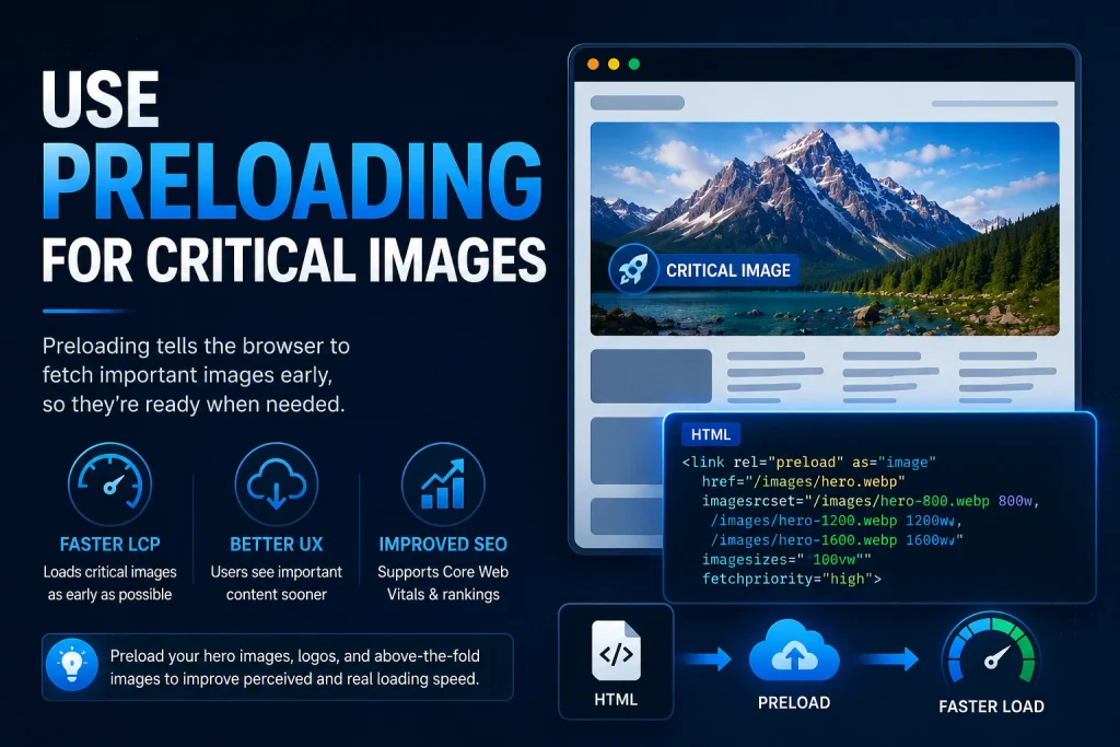
Preloading tells the browser to start downloading a specific resource as early as possible — before it would normally discover it in the HTML. For the most important above-fold image (typically the hero image or LCP element), preloading can significantly improve Largest Contentful Paint by getting the image download started milliseconds earlier.
Without preloading, the browser discovers the hero image URL only after it has parsed the HTML, processed CSS, and identified the image tag. With preloading, the browser begins downloading the hero image immediately upon receiving the first byte of the HTML — potentially 500ms to 1 second earlier on typical connections.
How to Implement Image Preloading
Add a preload link in the document head for your most important above-fold image:
html
<head>
  <!-- Preload the LCP image -->
  <link
    rel="preload"
    as="image"
    href="hero.webp"
    type="image/webp">
</head>
For responsive images with srcset, preload with imagesrcset:
html
<link
  rel="preload"
  as="image"
  imagesrcset="hero-480.webp 480w, hero-768.webp 768w, hero-1920.webp 1920w"
  imagesizes="100vw">
Important: Only preload the single most important above-fold image — typically the LCP element. Preloading multiple images competes for bandwidth and can actually slow down other critical resources. Preloading works best for the one image that matters most for perceived loading speed.
Preloading in WordPress
Some WordPress performance plugins add preloading automatically. WP Rocket identifies the LCP image and adds the preload link tag automatically. If you’re managing WordPress performance manually, identify your LCP image using Chrome DevTools or PageSpeed Insights, then add the preload tag to your theme’s header.php file.
Technique 10 — Strip Image Metadata
What Is Image Metadata and Why It Adds to File Size
Digital images contain metadata — information stored in the file about the image itself rather than the visual content. Camera metadata (EXIF data) includes camera model, lens information, shooting settings (aperture, shutter speed, ISO), GPS coordinates of where the photo was taken, and date/time of capture. Color profile information (ICC profiles) stores colour space data for accurate colour reproduction across devices.
For web images, most metadata is completely unnecessary. A visitor viewing a product photo doesn’t need to know the camera model, lens focal length, or the latitude and longitude of the photo studio. Stripping this metadata reduces file size without any visual impact.
Typical metadata size in image files:
- EXIF data: 10 to 100KB per image (varies significantly)
- ICC colour profile: 1 to 5KB (sRGB profile) to 500KB+ (embedded profiles)
- IPTC data (copyright and description info): 1 to 50KB
- XMP data (extended metadata): 5 to 50KB
For a 200KB web image, 50KB of metadata represents 25 percent of the file size — data that adds no visual quality and purely increases download time.
How to Strip Image Metadata
In Photoshop: When using Save for Web, uncheck the Metadata options. Choosing None removes all metadata from the exported file.
In Preview on Mac: Preview strips most metadata automatically during export.
Online tools: Our Image Compressor strips unnecessary metadata during compression — the output file contains only the visual data needed for display.
In WordPress: The Imagify and ShortPixel plugins strip metadata automatically during image optimisation. WP Rocket integrates with these plugins to handle metadata removal as part of the optimisation workflow.
Important exception — don’t strip all metadata: ICC colour profiles matter for accurate colour reproduction — especially for product photography where colour accuracy is important. The sRGB colour profile (2 to 4KB) should be kept for web images. Strip EXIF, IPTC, and XMP data — keep the ICC colour profile.
Technique 11 — Use Next-Generation Delivery With the Picture Element
Progressive Enhancement for Image Delivery
The HTML picture element allows you to serve the best available image format to every browser — with automatic fallbacks for older browsers that don’t support newer formats. This ensures every visitor gets the fastest-loading image their browser can handle, without any browser errors or broken images.
html
<picture>
  <!-- AVIF for browsers that support it — best compression -->
  <source
    type="image/avif"
    srcset="image.avif">

  <!-- WebP fallback — excellent compression, 96% support -->
  <source
    type="image/webp"
    srcset="image.webp">

  <!-- JPG ultimate fallback — works everywhere -->
  <img
    src="image.jpg"
    alt="Image description"
    width="1200"
    height="628"
    loading="lazy">
</picture>
Browsers read the source elements in order and use the first format they support. Chrome and most modern browsers use AVIF (where available). Safari, Firefox, and Edge use WebP. Very old browsers fall back to JPG. No JavaScript, no complexity — pure HTML.
AVIF — The Next Step Beyond WebP
AVIF (AV1 Image File Format) achieves 40 to 50 percent smaller file sizes than JPG at equivalent quality — even better than WebP’s 25 to 34 percent advantage. Browser support reached 75 percent in 2024 and is growing.
For sites targeting performance-conscious audiences on modern browsers (tech blogs, developer tools, SaaS platforms), implementing AVIF with WebP and JPG fallbacks via the picture element gives the best possible image loading performance in 2026.
Technique 12 — Optimise Your WordPress Image Settings
WordPress-Specific Image Performance Settings
WordPress introduces several image-specific performance considerations beyond standard web best practices.
Disable WordPress’s automatic JPG compression:
WordPress compresses uploaded JPG images to 82 percent quality by default. Add to functions.php to control this:
php
// Set WordPress JPG quality to 90 percent
add_filter('jpeg_quality', function($arg){ return 90; });
Or disable completely and control compression before uploading:
php
// Disable WordPress JPG compression entirely
add_filter('jpeg_quality', function($arg){ return 100; });
Enable WebP uploads and serving:
WordPress 5.8+ accepts WebP uploads. WordPress 6.1+ automatically generates WebP versions of uploaded JPG images. Ensure your server supports WebP processing in GD or Imagick — check Site Health (Dashboard > Tools > Site Health > Info > Media Handling).
Clean up unused image sizes:
WordPress generates multiple sizes of every uploaded image. Over time, these accumulate and waste server storage. The Regenerate Thumbnails plugin lets you remove unused sizes and regenerate only the sizes your current theme actually uses.
Our comprehensive guide on WebP images for WordPress covers the complete WordPress image optimisation workflow — including WebP upload, serving, fallbacks, and caching configuration.
The Complete Image Loading Speed Workflow
Before Uploading Any Image — The Pre-Upload Checklist
Following this checklist for every image eliminates loading speed problems before they reach your website:
- ✅ Format: Convert to WebP (lossy for photos, lossless for graphics)
- ✅ Dimensions: Resize to correct display dimensions (check with browser inspector if unsure)
- ✅ Compression: Compress to target file size (under 150KB for most images)
- ✅ Metadata: Strip unnecessary EXIF and IPTC data (keep ICC colour profile)
- ✅ File name: Descriptive file name for SEO (hyphens not underscores)
- ✅ Alt text: Accurate, descriptive alt text for accessibility and SEO
After Uploading — The Post-Upload Verification
- Run the page through Google PageSpeed Insights
- Check for “Efficiently encode images” warnings — fix any flagged images
- Check for “Properly size images” warnings — re-upload at correct dimensions
- Check for “Serve images in next-gen formats” warnings — convert to WebP
- Check for “Images not in explicit sizes” — add width and height attributes
- Verify LCP element — preload if it’s an image
- Verify CLS score — check all images have dimensions defined in HTML
Measuring Image Loading Performance
Google PageSpeed Insights
The most important free tool for measuring image performance. Go to pagespeed.web.dev and run both mobile and desktop tests. The Opportunities section shows image-specific improvements with estimated savings for each fix.
Key image-related opportunities:
- Properly size images — shows each oversized image and potential savings
- Efficiently encode images — shows each over-compressed or wrong-format image
- Serve images in next-gen formats — flags JPG and PNG images that should be WebP
- Defer offscreen images — flags below-fold images without lazy loading
- Preload Largest Contentful Paint image — flags when the LCP image should be preloaded
Chrome DevTools Network Tab
Press F12 in Chrome to open DevTools. Go to the Network tab and filter by Img to see all image requests. For each image you can see:
- File name
- Status code
- File type (check for webp)
- File size
- Time to download
Images taking more than 500ms to download are worth investigating — check if they can be compressed further, converted to WebP, or served from a CDN.
WebPageTest
webpagetest.org provides detailed waterfall charts showing exactly when each image loads relative to other page resources. This identifies images that are blocking critical rendering — particularly useful for identifying above-fold images that need preloading.
Frequently Asked Questions
1. What is the fastest image format for websites in 2026?
WebP is the best balance of performance and compatibility — 25 to 34 percent smaller than JPG at equivalent quality, 26 percent smaller than PNG lossless, with 96 percent global browser support. AVIF achieves 40 to 50 percent better compression than JPG but only has 75 percent browser support. Use WebP as your primary format with JPG fallback. Add AVIF via the picture element if targeting performance-focused audiences.
2. How much can image optimisation improve my PageSpeed score?
For sites with unoptimised images, switching to WebP format, correct dimensions, and proper compression typically improves mobile PageSpeed scores by 10 to 30 points. Sites with heavily unoptimised images — PNG photographs, camera-resolution uploads, no compression — can see 40 to 50 point improvements. Image optimisation is consistently the highest-impact single category of PageSpeed improvements for most websites.
3. Does lazy loading affect SEO?
Google’s crawlers support lazy loading and can index lazy-loaded images correctly. Native lazy loading (loading="lazy") is specifically recommended by Google for below-fold images. Never lazy load above-fold images — this hurts LCP scores and is a common mistake.
4. What is the best image size for fast loading?
Under 150KB for most web images as WebP at 80 to 85 percent quality. Under 30KB for thumbnails and icons. Under 200KB for hero images. Under 300KB for full-width background images. These targets are achievable with correct dimensions plus WebP compression without any visible quality difference at normal screen viewing sizes.
5. Does a CDN really make images load faster?
Yes — significantly for international visitors. A CDN reduces latency by serving images from a server near each visitor. For a visitor in Tokyo loading a page from a US server, a CDN can reduce image request latency from 200ms to 15ms — saving 185ms per image. For 10 images on a page, that’s 1.85 seconds of latency saved.
6. What is the difference between image compression and image resizing for performance?
Resizing reduces pixel count — fewer pixels means less data to store and download. Compression reduces how efficiently the existing pixels are stored — same pixel count, smaller file. Both reduce file size but through different mechanisms. For the biggest file size reductions, do both — resize to correct display dimensions first, then compress. Combining both can reduce a 5MB camera photo to under 100KB for typical web use.
7. Should I use WebP or AVIF in 2026?
Use WebP as your primary format — 96 percent browser support makes it safe for all websites. Add AVIF as an additional source in the picture element for browsers that support it (Chrome, Firefox, Brave) — they’ll get even better compression. Keep JPG as the final fallback. This progressive enhancement approach serves the best available format to every visitor.
8. How do I fix Google PageSpeed’s “Properly size images” warning?
Right-click the flagged image on your website, select Inspect, and find the rendered dimensions in the developer tools. Compare these to the intrinsic dimensions shown in the PageSpeed report. Resize the original image to match the rendered dimensions using our Image Resizer, re-upload, and run PageSpeed again to confirm the warning is resolved.
9. Does image metadata affect loading speed?
Yes — metadata adds file size with zero visual benefit for web images. EXIF data (camera info, GPS location), IPTC data (copyright info), and XMP data can add 10 to 100KB per image. Stripping metadata during compression or export reduces file size without any change to the visible image. Keep the ICC colour profile for accurate colour reproduction.
10. What is the LCP image and why does it matter?
LCP stands for Largest Contentful Paint — the time for the largest visible content element to load. On most websites, the LCP element is an image — hero image, featured image, or large product photo. Google uses LCP as a Core Web Vitals ranking signal. Good LCP is under 2.5 seconds. The LCP image should never be lazy loaded and should be preloaded for the fastest possible appearance time.
Conclusion
Increasing the speed of image loading is the only web performance enhancement that could have the maximum effect on most websites. More than half of the average page weight is made up of images, and all of the mentioned methods directly decrease their size and loading time.
These methods reinforce each other. Conversion to WebP saves 25 to 34 percent of the size. Right dimensions remove extra pixel information and make images smaller by 60 to 80 percent. Compression at 80 to 85 percent quality deletes unnecessary information. Lazy loading saves the time needed to download an image that will not be seen by the user. Using the srcset attribute sends a properly sized image to every device. CDN saves from latencies for foreign customers. Caching does not require reloading on future visits. Removal of metadata deletes unnecessary information from images.
When used all together, these techniques can save from 80 to 95 percent of the image size.
Start with the highest-impact changes first. Convert all website images to WebP using our free JPG to WebP converter and PNG to WebP converter. Compress everything to target file sizes using our Image Compressor. Resize to correct dimensions with our Image Resizer. Add lazy loading and dimension attributes to all images. Then measure with PageSpeed Insights and work through any remaining flagged items.